[The updates for the topic “Pandemonium” on this blog site provides a rundown on the daily statistics of this viral infection. As the number of cases globally have spread, it’s difficult to keep up with each and every case. The “brief” will be kept short and simple and center on the cases in the Philippines based on information from the Department of Health. Readers are asked to refer to other sites, especially https://www.worldometers.info/coronavirus/ or https://www.who.int/emergencies/diseases/novel-coronavirus-2019 or https://ourworldindata.org for specific information in particular countries. For references for Philippines data, they are cited separately.]
Update as of 7PM 07 June (Sunday)
TOTAL CONFIRMED CASES: 7.007,698
TOTAL DEATHS: 402,683 (case fatality rate: 5.75%)
TOTAL RECOVERED: 3,428,961 (case recovery rate: 49%)
https://www.worldometers.info/coronavirus/
Total cases worldwide (note that every reference has its own cut-off time for reporting. For the global data, https://www.worldometers.info/coronavirus/ is used as its reference.)
We have officially crossed the 7M mark at 7PM. Almost half the total cases having recovered. Of the more than 7M cases, more than half have already had an outcome – 89% have recovered while 11% died. Only a little more than 45% of the cases remain active.
These are good numbers because they indicate that while the number of cases continue to increase (driven by more testing and contact tracing), majority of them already had an outcome and the fatality rate is generally lower now. This could also mean that most the positives were identified from contact tracing and that they are probably mild or asymptomatic/pre-sysmptomatic.
The global data shows that the average cases is still more than 100,000 case per day. The total number of cases are now over the 130,000 per day mark.

https://www.worldometers.info/coronavirus/
And while the daily new cases plateau at over 130,000 for the 3rd consecutive day, the number of deaths declined from 4906 yesterday to 4253 today.

https://www.worldometers.info/coronavirus/
The United States of America continues to lead globally in the number of total confirmed cases at 1,988,545 (up by more than 22,000 cases overnight) with a case fatality rate (CFR) lower today at 5.64% with 112,096 total deaths recorded. Among the states, New York leads at 396,699 total confirmed cases and 30,372 total deaths up with a lower 7.66% case fatality rate (CFR) as the number of deaths slows down for the last week.
Brazil remains in second with a lower CFR at 5.32% with a haul of over 30,000 cases. Total cases are now at 676,494. Russia is in third with a CFR of 1.25% and total cases of 467,673. India remains in sixth spot with 247,195 cases and a CFR steady at 2.81%.
The South American countries are now the hotbeds in terms of cases for the last two weeks. Brazil tops the list at number 2 in the world, Peru stays at 8th today, and Chile remains in a close 13th place. These three countries combined make up more than 1M cases in the world.
In Southeast Asia, Singapore slips down further to 29th in the world, with Indonesia going up to 32nd spot and the Philippines moves down to 39th from 38th in the world.

Based on the dashboard of the World Health Organization https://covid19.who.int, the global data shows the Americas leading the number of cases, followed by Europe and the Eastern Mediterranean.
As several countries ramp up testing in various degrees, more new confirmed cases are being reported. With more testing and aggressive targeted contact tracing, patients who may be asymptomatic or pre-symptomatic and who may potentially be infective to the vulnerable population are being identified. With more testing, we see a better picture of the extent of the pandemic. There are, however, some countries who may not not be performing a lot of contact tracing and/or testing, but have better outcomes than others that do.
For a discussion on how much testing is “enough” testing, the link to this discussion is here https://relativejoyforyou.wordpress.com/2020/06/04/enough/
There are multiple factors that determine how outcomes of pandemics play out. Policy responses include school and workplace closures, cancellation of public events and gatherings, restrictions on public gatherings, public information campaigns, stay-at-home restrictions, international and domestic travel (public transport, restrictions on internal movement and international travel controls), and of course, testing and contact tracing.
The median average of case fatality rates worldwide has further declined to 5.75% (from 5.8% yesterday). For the past 2-3 months, over 89% of patients are either asymptomatic or have mild disease and have recovered.
The good news? Recoveries far outnumber the deaths with a ratio of approximately 8.5:1. (The ratio of recoveries continues to increase, and will reassuringly do so, over deaths because of increased testing and better minimum healthcare standards.)
Philippines Statistics
Refer to the link https://www.doh.gov.ph/2019-nCoV for up-to-date data or to http://www.covid19.gov.ph (this latter is not a secure site). The new site for the Department of Health is supposedly migrating to COVIDKAYA so that data is updated. The current site still maintains the COVID19 tracker. Readers can check their official site where Data Drop for raw data can be found.
One useful site is https://covid19stats.ph where one can see the dashboard of information from the DoH website. Unfortunately, because of the migration of the data drop into COVID Kaya, no one is able to break down the numbers to the finer details as in the previous posts.
Good news. Bad news: The wrap for the day
There are 555 new confirmed cases today compared to the 714 yesterday. And expectedly so. Since we’re doing an average of 10,000 tests a day, and the positivity rate is around 7%, (assuming that the positive rate is constant), we should have an output of approximately 700 positive cases a day (not including backlogs).
Today we breach the 1,000 mark for deaths at 1,003 total deaths with 9 deaths publicly reported.
Of the 555 new confirmed total cases, there are more fresh cases (378) than late (177).
Of the 350 “fresh cases”, Region VII has 104 cases, NCR with 67, others at 204, and repatriates with 3.
Of the 177 “late cases”, Region VII has 63 cases, NCR 25 and Others 89.
Fresh or late, the other regions are bothersome because we have 293 of the 555 cases from these “other” areas. Region VII continues its upward trajectory with 167 total cases while the NCR has 92 reported today.
With more backlogs coming in, the numbers are expected to rise. The good news is that the deaths remain low in spite of the increase in number of positive cases. Whether these remaining positive cases are retests from previously positive patients who are recovering or have recovered are unknown.
As of today, the Philippines still adopts the criteria of having two negative consecutive tests to be considered a recovery. This most likely accounts for the low recovery rate because many patients don’t take the initiative to have retesting done, especially when they are mild or asymptomatic and have clinically recovered. Other patients who are retested over and over but remained positive in spite of clinical recovery past the clinical course of illness are probably included in the count on positive tests.
Today’s total brings the case fatality rate of the Philippines to its lowest of 4.58% (good news) and recovery rate is again a tad lower at 20.7% as the number of total cases are still more than 500 today. The low recovery rate is probably due to the reporting system of recoveries in the country with the LGUs having different data from the national agency.


According to the Department of Health, based on the remaining 15,905 active cases remaining as of June 06, 2020, 95.1% (15,131 cases) are mild while the remaining 4.4% (698 cases) are asymptomatic. Only 0.5% of the remaining active patients are severe (57) or critical (19).

With the current data, the growth rate eases at around 3% but the doubling time remains approximately 10 days. While Indonesia has a higher case fatality rate compared to the Philippines (6% vs 4.58%), recovery rates in Indonesia are far better than ours (32% vs 20.7%). Overall, 82% of all cases in the Philippines are recoveries, while 18% lead to death. Making us the lowest among the Southeast Asian countries in terms of recoveries-to closed cases ratio.
Testing capacity


As more RT-PCR laboratories are being licensed, we’re having more tests conducted. At least 3735 test/M population are being carried out per day. As of June 5, a little over 2,000 samples are left in the backlog. Hopefully, this closes in towards the middle of next week.
Of the 420,166 total tests conducted in 386,726 individuals tested, the positivity rate is now lower 7.1% from a previous 7.3% (which means that we are testing enough to see the prevalence of the pandemic in the country. The number of positivity is also going down in spite of the higher testing capacity). This is an important issue to discuss as certain areas in the country have a very high death rate compared to the over-all case fatality rate. It is recommended that those areas with high death rates (>10-12%) should have more aggressive testing and contact tracing done.
For example in one community if there is one death in 1 case, the case fatality rate is 100%. Because the virus is highly infectious, there must be other cases undetected within the community. Targeted aggressive contact tracing should be done within that community so that those that are positive can be quarantined or isolated, in order to contain a potential outbreak.
Majority of the patients tested (~93%) tested negative. This means for every 13 patients, 1 would most likely test positive.
Breakdown the day before
Yesterday, of the 714 new cases announced by the Department of Health, 415 had residence information tagged. 273 cases were reported in Luzon, 173in Visayas, and 5 in Mindanao. There was no report among the repatriates.


Based on cases per region, the NCR still has the most number of cases followed by Region VII and Region VI-A. While Region VII may have more than 3100 cases, it has the lowest fatality rate.
Based on cases per city, 9 of the top 10 cities are within the NCR. Quezon City ranks first, followed by Manila and then Makati. While most of the cities have seen a growth in cases over the past week, the highest increase in growth rate goes to Cebu City with a 4.73% growth rate overnight (from 4.4% the previous day).
These places matter
How many tests should be done to say we’re doing enough testing?
Among countries that do extensive testing, if < 12% are coming back as positive results, then we’re most likely doing enough tests in the country. The benchmark of a system that’s doing enough testing to pick up all or most of the cases is getting 10-30 negative cases per confirmed cases for an overall positivity rate of 3-10%.
How does that kind of data extend to the 7,641 islands of the Philippines? And how can the community use this kind of information in order to determine if they are testing enough?
The death rate or number of deaths is another good indicator if there is sufficient case finding in the community. The same parameter above can be used to determine if the regional or local community is doing enough to combat the virus through targeted testing.
Based on region breakdown for example, Regions 1, 10 and BARRM have >10% case fatality rates, Region 1 has 16% death rate (12/74), Region 10 has 24% (9/34) and BARMM 18% (7/22). [In parenthesis are deaths/confirmed cases]. An indicator that we’re not testing enough or looking for more cases in those regional communities. The likelihood missing out positive cases among deaths due to COVID in these regions is high.
As I previously mentioned, breaking down the cases per barangay or city provides better information to the local community on mitigation actions that they may need to take in order to control the spread of the pandemic. As a general guide, if the death rate in the area is >10-12%, they’re probably not testing enough.
Sometimes the numbers look impressive because the general rule is that the region is doing fine in numbers but the better numbers are being carried by the general data of the region. For example, in the National Capital Region (NCR), where we do extensive testing, the case fatality rate is 6.3%. This is driven by the fact that there are 752 deaths in almost 12,000 cases as of yesterday for the NCR. If you break them down according to cities on the other hand, Pasig (10% CFR), Muntinlupa (10% CFR) and San Juan (13% CFR), have the highest case fatality rates in the National Capital Region.
What is confusing in the gap of information is the disparity in the data on confirmed cases, deaths and recoveries per city compared to that of the Department of Health. This must be reconciled at the soonest.
Remember, there should be ‘enough’ cases for every death because a high death rate implies that the specific locality is not doing enough in contact tracing. It is highly unlikely that the locality had 1 case with 1 death with no other person in the community being infected.
Outside of the National Capital Region, the following cities (according to the Data Drop of the Department of Health as of June 6, 2020) have death rates more than 10-12% and positive cases less than 50: Lipa Batangas (15%), San Mateo Rizal (18%), Marilao Bulacan (12%), Malolos Bulacan (17%), General Trias Cavite (13%), Nasugbu Batangas (14%), Meycauayan Bulacan (17%), Angono Rizal (12%), Bacolod (19%), Cagayan de Oro (33%), Silang Cavite (15%), Trece Martires Cavite (17%), Calauag Quezon (10%), Tarlac City (10%), Calapan Mindoro Oriental (11%), Candelaria Quezon (13%), Naga Camarines Sur (14%), Naic Cavite (14%), Guinobatan Albay (17%), Lambunao Iloilo (21%), Iligan Lanao del Norte (40%), Bayambang Pangasinan (40%), Alitagtag Batangas (25%), Norzagaray Bulacan (25%), Obando Bulacan (25%), San Miguel Bulacan (25%), Labo Camarines Sur (25%), President Roxas Capiz (25%), San Jose Occidental Mindoro (25%).
33% each (1 death in 3 cases) for the following cities: Tabaco Albay, Alfonso Cavite, Guimbal Iloilo, Dumaguete Negros Oriental, Solano Nueva Vizcaya, Bacolor Pampanga, Floridablanca Pampanga, Lingayen Pangasinan, Malasigui Pangasinan, Rosales Pangasinan, Jalajala Rizal, Castillejos Zambales, Pagadian Zamboanga.
The following municipalities/cities reported only 2 cases but had either ONE or TWO deaths: Cuenca Batangas, Taal Batangas, San Ildefonso Bulacan, Carcar Cebu, Daanbantayan Cebu, Samal Davao del Norte, Malta Davao Occidental, Barotac Nuevo Iloilo, Agoo La Union, Banaue La Union, Mantao Lanao del Sur, Tudela Misamis Occidental, Jimalalud Negros Oriental, General Mamerto Natividad, Jaen Nueva Ecija, Puerto Princesa Palawan, Candaba Pampanga, Alaminos Pangasinan.
The following areas had 1 case and the only reported case had died for a 100% death rate: Catarman Cebu, San Juan La Union, Sta. Maria Laguna, Tayasan Negros Oriental, Naujan Oriental Mindoro, Apalit Pampanga, Barista Pangasinan, San Fabian Pangasinan, Urbiztondo Pangasinan, Tiaong Quezon, Lambayong Mariano Marcos Sultan Kudarat, and Indanan Sulu.
[Disclaimer: The aforementioned data are from the Department of Health data drop as of June 6, 2020. LGU data may be different and the author recommends that the LGU coordinate with the DILG and the DoH regarding reconciliation of data.]
The week in review
To recap the week in one word – shocker!
With all the backlog details returning in bulk, the Philippines had seen a significant rise in cases as more tests were being conducted as well.


While we had an upsurge in cases at the start of the week, the good news is that the number of deaths have remained low. As a matter of fact, generally the average deaths for the week was 6 deaths/day, while the average number of confirmed cases (fresh or otherwise) was 588 cases/day. Recoveries were very slow considering that most of these patients should have recovered as the majority (~94%) are mild and around 5.5% are asymptomatic. Cases as far back as May 22 should have seen outcomes already based on the DoH claim that of the remaining over 15,000 active cases being mild/asymptomatic.
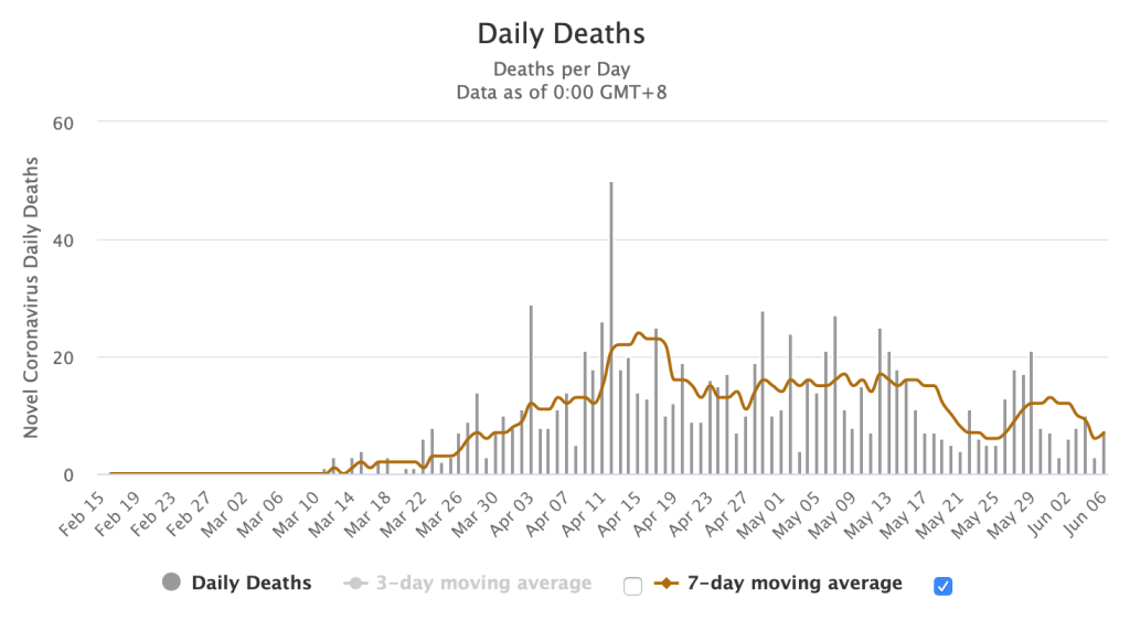
In the last graph above, this shows a summary of how we’re doing overall since the beginning of the pandemic. The blue curve showed a decline in cases (bending of the curve) until a week ago when the backlogs and more testing results came in. This resulted in the increase in the number of cases for the past week. But the green curve shows a continuous trajectory of the death rates in the country in spite of the single day surge of publicly announced death reports.
- Over the past week, the National Capital Region had 1,174 additional cases but the 7 day average growth rate was at 1.49% with a CFR of 6.31% and recovery rates at 27%. Region VII on the other hand saw a spike of 1,164 additional cases over the week with a 7 day average growth rate at 6.48%, a low CFR of 0.86% and a low recovery rate of 4.16%.
- Children below 19 years old make up 7.57% of the total cases while 18.14% are the senior citizens (> 60 years old). This means that almost 75% belong to the 20-59 year old age group (out of 21,340 data points). The group that’s actually allowed to roam around and go out.
- In terms of fatality rate, those below 19 years old have a death rate of 2.3% whole those above 60 years old have a death rate of almost 65%.
How is the coming week going to fare?
With the backlog data coming in and more testing being done, we may probably still be averaging over 500-1000 cases a day in the coming week. As long as the death rates remain low, then that’s the good news. The better news? The positivity rates decline significantly so that the numbers start going down. If we get both, it’s called a blessing.
To get in touch with the Department of Health, the COVID hotline is (02)894-COVID loc 1555.
Disclaimers:
(1) These three parameters (new confirmed cases, new recoveries, new deaths) ARE NOT real-time data. The data provided by the Department of Health is the date of public announcement. Even global data will vary in time of reporting, depending on the reporting capacity of that country. To date, the latency period of the Department of Health on reporting recoveries averages almost 10 days (with more than 50% reported after 8 days and more) and deaths averaging almost 12 days (with more than 50% being reported after 8 days or more).
(2) Depending on where testing is done, RT-PCR test results take an average of 12hrs – 2 days to process. Barring any delays, all tests done should ideally be released by at least 48 hours (the earlier the better). However, the test results released from government facilities now range from 3-7 days (based on Data Drop) when compared to private hospitals where fewer number of tests are performed.

Thank you and congratulations for your excellent writing. Yours is the most intelligent presentation I have ever seen so far about our COVID19 problem. How I wish your views will reach our decision makers in govt.
LikeLike
Thank you very much for another comprehensive report.
LikeLike
Thank you for your insightful presentation. The data should allow us to appreciate reality vis-a-vis histeria and fear. Will help disseminate these data
Best regards. Boy Bordeos
LikeLike
Wow, this is so far the most comprehensive and well written analysis of COVID-19 I’ve read so far!
Thank you very much!
LikeLike
Pls keep posting this article updated every few days so we can see the progress Sana. Thank you so very much. It’s very informative.
LikeLike
Pls keep posting this article updated every few days so we can see the progress Sana. Thank you so very much. It’s very informative.
LikeLike
Pls keep posting this article updated every few days so we can see the progress Sana. Thank you so very much. It’s very informative.
LikeLike
Very insightful literatures re this pandemic. Factually written, truthfully revealed, intelligently analyzed. Congratulations
LikeLike
Thank you for this comprehensive yet easy read analysis, doc. Helps calm frayed nerves. If only the powers that be listen and judiciously act on these observations. Again, thank you! Keep safe.
LikeLike
Thank you for this comprehensive yet easy read analysis, doc. Helps calm frayed nerves. If only the powers that be listen and judiciously act on these observations. Again, thank you! Keep safe.
LikeLike
Hi ! Great work on this maam!
LikeLike
The data and analysis is a huge boon to epidemiologists and clinicians both in our country and worldwide. You’re always out guiding light, Doc Benjie. Stay safe and healthy!
LikeLike
Hi doctor is there any data on the comorbidities of the fatalities. In Italy 99% of deaths had comorbidities is the same true for the Philippines?
LikeLike
There is and you can look at the data drop of the Department of Health in their website, the link of which is provided in my blog.
LikeLike
Hi Doc! I checked the latest data drops by DOH and it doesn’t indicate what the comorbidities of those who died of COVID-19 were. It only shows the health status (mild, asymptomatic, recovered, died) but does not indicate if they were hypertensive or diabetic, etc. They used to indicate in their death bulletins the complete diagnosis of the deaths that are usually indicated in the death certificates but they stopped doing that.
LikeLike
Yah. I was also looking at that. Well they said that a lot of their data are incomplete. Hayyy
LikeLike
I’ve been trying to look for that data to see if the opinion in these articles hold up https://edition.cnn.com/2020/04/21/opinions/safer-way-to-get-america-back-to-work-schulze-vijayan/index.html and the article about herd immunity from UST doctors. With the comorbidities data available, it might shed some light if this is feasible.
LikeLike
Well my opinion on here immunity is diverse. First of all, we don’t know how long immunity will last after an infection (sustained immune response). Which makes it dangerous as a reinfection. Example is dengue where a second infection is worse that the first. I am not a fan of herd immunity without a treatment in sight. Perhaps if there were, then it be easy to deal with patients that don’t develop immunity to an infection. But that’s just my thought.
LikeLike
Thank you for your thoughts doc. I do agree that we do not completely understand COVID-19 at this point to fully implement their proposals. However, it would be nice to have sufficient data to at least discuss a possible middle ground because I’m sure we cannot sustain a prolonged lockdown without repercussions.
LikeLike
Yep. That’s what I’ve been harping on from the get go. Data lang yan ha. Am not even asking for anything more. It’s like for more than 6 weeks we’ve not moved past data collection and good data. Hahahaha. Gosh. How do they even make decisions with bad data?
LikeLike
Unfortunately, I think at this point they’ve been making “logical” decisions and not exactly “data-driven” ones. I’m glad they did the Data Drop idea but I still find the information there lacking. It solves transparency but it cannot be used to make future data-driven decisions yet. Let’s hope it gets better because once more accurate and comprehensive data comes out I’m sure better recommendations can be made. Thank you also doc for the posts that you’ve been posting. Very helpful to read through.
LikeLike
Thank you for sharing your opinions. I agree on the transparency of the data drop. I think the government is using all the resources available at the moment. And you’re right. We all hope that it gets better and that they solve this latency of data problem soon.
LikeLike
Why do you show total number of cases graphs for the various countries? The total number of cases is not a good indicator of infection rates compared to other countries. For example Liechtenstein in Europe has a total of 84 people infected while the neighbour Germany has 145,742 infected. By your comparrison Liechtenstein is combatting the virus more successfully than Germany, but the reality is that it is worse. Liechtenstein has 2,124 confirmed cases per 1 million population while germany only 1,739 confirmed cases per 1 million people. The population of the country matters. The population of USA is 3 times bigger than the population of the Philippines. Yes, the Philippines has less infected cases per population, but this does not determine if the Philippines is doing better at preventing the spread. For that you have to consider many factors.
The thing we all have to think about regarding efforts to manage this pandemic is the cost vs the benefit and the feasibility. The feasibility is difficult to determine, so it is important to ask yourself. Are these efforts going to end the virus existence completely? If not then the eradicating the virus is not the end goal. This can be determined within 1 month of trying community quarantines. If the virus cannot be successfully eradicated within 1 month, then the cost vs benefit becomes more important. If the efforts to stop the virus start to kill people from other factors caused by community quarantines such as affordable access to medical care for preventable deaths and access to necessities of life or violent crime levels increasing. This is important for every nation. The police budget, the food budget and the medical budget are critical to the successful management of a pandemic. If more lives are lost due to starvation, violent crimes, and other factors then the community quarantines are not successful. Even if the doubling time increases, the impact on the community could be doing more damage. This is very important to monitor and compare. Without comparing to these other factors we are being narrow minded and could be making some vital mistakes.
Rich countries can afford to hand out money and emergency aid to their people to prevent the negative impacts of managing the pandemic from negatively affecting their citizens but not all countries can afford that. Some countries could be putting national security at risk while trying to protect the people who are vulnerable to the virus. Even if slowing the spread helps buy time, the cost could be quite high with respect to the lives of others. Think about the war on drugs for example. If the war on drugs is not funded as much due to the war on the virus, then the drug problem might grow while the virus problem is being reduced, but if the government runs out of money then both the war on drugs and the war on the virus are at risk.
There have been statistics suggesting that 90% of fatalities are in patients with underlying medical conditions. These people we love and care about are at risk of significantly reducing their life expectancy. Unfortunately we have to remember the children and families that could also die due to restricted access to food, medical care and violent crimes. Younger healthier individuals could possibly be dying from our actions and while we focus our attention on the elderly and vulnerable people to save them to live for 5 more years or whatever, we might be taking 50 plus years away from someone who could have lived if only they were noticed.
The efforts to prevent the spread of the virus and prevent as many losses of lives are definately important, but we must be careful not to lose sight if the bigger picture and we must understand that all of this is very complicated and difficult to manage. It is very important to also spend some of our time and resources on investigating the effects of lock downs and how that is comparing to our global fight against this virus. It would be a huge service to the people if the statistics of the virus were shown along side the statistics of the effects from the war on the virus so that the professionals can be making better management decisions. Unfortunately these other statistics are not very visible to the world.
LikeLike
I totally agree with you. Please note that the disclaimer here is that this is only part of the original blog entitled Pandemonium. The data in The Brief are just the daily changes since the start of my blogging about the pandemic. The topic about the other factors you mentioned are tackled in various sections already (albeit, piecemeal) as a blog is meant to address one topic at a time. But yes. I totally agree with you on most of your points.
There are various links referenced and the readers are actually encouraged to go to these links so that the real scenario is seen and that other data like number per million are taken into consideration. The Brief is a guide on how data is interpreted. Mathematical modeling is not achievable in a virus as fluid as SARSCOV2 and outcomes depend on various measures taken by individual countries and societies.
Thank you for your comment. Appreciate the feedback.
LikeLike
I just want to say thank you. That someone actually tried to make sense of all this Data that’s not analyzed and presented as counts if this and that. I’m so relieved to have someone who can say that there is some kind of progress albeit a tenuous one. Thank you for this. I will keep on following your analyses of data.
LikeLike
Hi Sir, Aren’t we supposed to use the date when the person got infected or at least the estimated date of infection (instead of the date the person was found positive)?
For example, person-A was found positive 10 days after exposure to person-B. Even if the test or the result of the test only confirmed the person was positive 10 days after (say 11 April 2020), the count should be charged on the date of exposure (01 April 2020). This way the trend data is more reliable.
If the date of exposure to a person with COVID-19 is not available, then at least the date when the person was included on the PUI, PUM, suspect, or probable list should be used (and “not” the date when the person was confirmed positive).
LikeLike
Unfortunately that’s not the proper way to report. Reports come in the way they are coming in. There will always be a lag time. There is no country that will give you 100% real time data. Sadly. Because there are barriers to reporting. If you well keep adjusting backwards we will never move forward. All the data can be reconciled at the end of the day. In short, when the pandemic comes to a closure.
Otherwise we will never see the end of having to reconcile reports. What we need now is an approach to timely coordination between the LGU and the national government on the reporting system. Nevertheless there will always be delays. As long as the gap is not long nor huge then it is acceptable.
China is a good example. Note that after their lockdown they reported additional 1520 deaths a week later. They had to reconcile their reports and carried it over but it did not affect the recovery or additional new cases. Just the over case fatality rate. But these are closed cases already.
LikeLike
Thank you for the response Sir. I understand that using the date when the results came out positive (instead of the “estimated” date of infection) can trend significantly different, and can cause people to make wrong assumptions (especially given we have backlog in testing).
Example: There were 7 days of continuous decline in the number of positive cases added (using the date when the results came out). Based on this, it could be assumed that things are getting better. However, if the estimated date of infection was used, the trend might show that cases are actually increasing (e.g. The number of cases in let’s say the last 2 days may actually need to be added/combined if the estimated date of infection occurred on the same day, instead of treating them as separate data points. I understand that this is possible given the backlog in testing).
I do understand that this may require continuous adjustments. However, given the importance of such analysis, it may be worthwhile to perform “in parallel” with what we are already doing. .
I also understand that real time data is impossible. However, if we are doing contact tracing, we should be able to come-up with a better estimate on when people got infected (e.g. the date when they were exposed to a person that is positive with COVID-19). If an estimated date of infection can’t be established, at least the date when they were included in the PUI/PUM/suspect/probable list can be used (as such is closer to the infection date than the date when the results came out).
I understand that other countries, like China, had a significantly better testing capability/capacity. As such, their testing backlog may be significantly lower than ours.
LikeLike
Hi Sir, I saw an article (see link below) based on the televised 4pm DOH briefing today. I think DOH answered the points I was concerned about in my previous messages to you.
https://news.abs-cbn.com/amp/news/04/23/20/has-the-philippines-flattened-the-curve-or-not-doh-explains?__twitter_impression=true
“Pero dahil ang tinitignan natin ‘dapat’ ang araw kung kailan naguumpisa ang sintomas ng tao, hindi pa rin natin masasabi na nagfaflatten ang curve ngayon,” Health Undersecretary Maria Rosario Vergeire said.
“Both Vergeire and Ho recognized that data is not completely accurate as the country has yet to reach its ideal testing capacity.”
I hope future trend analyses can use more reliable data (i.e. data based on the estimated date of infection or the available data closest to the date of infection, instead of the date when the test results came-out or when the test results were validated). Even if such would entail continuous adjustments, the basis for assumptions/decisions will be more accurate. Thank you.
LikeLike
I totally agree. That’s why I always say we’re not flattening the curve. The question that has begged an answer is – what is our true testing capacity in order to say that we are testing enough? There is no trend analysis and no mathematical modeling in something as fluid as this virus. Numbers will only tell us what we currently see – like the snapshot of a camera – and cannot tell what happened before and after until we try to recapture it later.
As all epidemiologists would agree, everything gets adjusted when it is in real time OR at the end of the pandemic when we know the exact numbers.
Thanks for following and commenting.
LikeLike
Thank you for putting together these numbers into something helpful and understandable. However, all this information, as helpful as they are in having a view of the outbreak, becomes meaningless as one realizes they’re based on a very low number of tests, the number of tests being far too low in a country of 104 million people – just recently only 5000 tests(and for a long time, 3000 or less). Since the country is not testing enough to give an accurate picture of how the virus is spreading, those numbers are not reliable – they create a false assumption on how the virus is affecting the country. Incredibly, the DOH has recently made a startling pronouncement that the country is now flattening the curve based on such a limited data. Epidemiology speaking, that does not make sense. It is a naive and dangerous conclusion.
LikeLike
Thanks for pointing it out. Hahahaha. I’ve been always saying that. But there are just people who think they know more just because they’re in position. Am trying to introduce a bit more logic. Perhaps tomorrow when I try to explain the R naught it might be clearer. But yeah. From my blogs from the get go have harped on testing. Sighhhhh. At least there are intelligent beings who read my blog. 😊
LikeLike
I’m still baffled with the increasing difference between the positive individuals and the confirmed cases. If the rest of the positive tests (ones not included in confirmed and are said to be for validation and processing on the table footnote) were retests (repeat tests?) why are they counted under unique individuals tested?
I totally agree that we are not doing enough tests. I also noticed that when we have a low number of new cases, the reported number of tests done is also low.
LikeLike
I have a feeling that the footnoting is confusing. Hehe. I don’t think they also were update the counter of unique individuals tested. But thanks for commenting. The DoH May have a different explanation 😊
LikeLike
https://news.abs-cbn.com/amp/news/04/20/20/philippines-logs-200-new-covid-19-cases-41-new-recoveries
“The DOH explained last week that the number of positive individuals may be lower than the actual number of reported cases because other results still undergo “validation and processing.””
LikeLike
😂
LikeLike
Hi Sir, DOH is now assessing the trend of Healthcare Workers with confirmed COVID-19 based on the “Date of Onset of Illness” (see link: bit.ly/COVIDPHSituationer007). DOH also mentioned that the number is subject to change after inclusion of incoming reports and review of cases.
I think this approach should be followed for “all” cases and not just for the Healthcare Workers.
As I mentioned in my previous messages, doing it otherwise (e.g. based on the date when positive results came out, or the date when positive results were validated) may cause people (especially decision makers) to make the wrong interpretations.
Using the estimated date of infection (or the onset of illness) minimizes unreliable data (i.e. inaccurate data driven by the backlog in testing and the delays in processing/validation of tests).
LikeLike
Yep. I saw that in their infographics. Agree with you. But that’s the most reliable data they have – the HCWs. Everyone else … well the case is in the air.
LikeLike
Nakakainis lang that they’re cherry picking only available data.
LikeLike
Hi Sir, I understand that several news companies seek your inputs and publish articles about what you say. I think this is a very important item that needs to get across quickly (either via the media or directly to the DOH, if you can directly communicate with them).
I see some articles implying that the latest numbers show that we’re plateauing. I find such very disturbing given that it is based on unreliable/inaccurate data. We should NOT continue using data based on the date when the positive results came out (or the date when the positive results were validated) given the significant delays in test processing/validation and the backlog in testing.
The “Date of Onset of Illness” should be used for “all” data/cases (and not only for Healthcare Workers) when performing trend analysis. DOH needs to shift towards this approach quickly so the government can make the right decisions.
Thank you.
LikeLike
Agree to some extent. That is why is shifted to using a logarithmic scale so that we can plot the exponential rise and it provides greater information than linear scales. The data of the DoH is reliable. It is just inaccurate. The 3 day running average is the recommended logarithmic scale for this kind of situation and I am trying to find a way to have to explain to the lay how to interpret this.
We all have our frustrations in the way the data is used by the epidemiology bureau but I think it provides some level of information on what’s happening. While ideally the “date of onset of illness” is ideal, this is impossible for all because of how information is gathered especially for patients who are not HCWs, some of whom cannot even provide the right information because of the latency of results. Did you see that 334 have posthumous results? They died before they could even get their covid results. Which I think may be a challenge. But yes I agree with you on this. The logarithmic scale should help scale this to a more realistic modeling approach.
Let’s keep the faith by barking at the tree. Hopefully by presenting it in a different manner, the government can present data more suitable to how they gather.
Thanks for the comment!
LikeLike
Agree to some extent. That is why is shifted to using a logarithmic scale so that we can plot the exponential rise and it provides greater information than linear scales. The data of the DoH is reliable. It is just inaccurate. The 3 day running average is the recommended logarithmic scale for this kind of situation and I am trying to find a way to have to explain to the lay how to interpret this.
We all have our frustrations in the way the data is used by the epidemiology bureau but I think it provides some level of information for epidemiological purposes. The DoH suddenly announcer we are flattening the curve. Hahaha. OMG!
LikeLike
Hi Sir, DOH already uses the “Date of Onset of Illness” for ‘all’ cases (bit.ly/COVIDPHSituationer009). I think this would significantly improve the accuracy of data.
However, as can be observed from DOH’s graph, the “Date of Onset of Illness” for the new cases in NCR are spread mostly over the last 20 days (a few reaching as far back as 45 days). As such, we should only look at the trend up to 15 April.
Given the number of positive individuals (12,976) vs total validated cases (9,684), there’s a significant chance that the trend is not downward or not plateauing after 15 April 2020 (if the 3,292 difference would fall over the last 20 days). Kindly note that based on DOH’s report, the difference is due to case information validation and processing (and not retesting).
Further to the foregoing, there are still 19,068 probable and suspect cases that have not been considered in the chart. Assuming 10% of this figure is positive, another 1,907 positive cases will fall on the last 20 days (which can further increase the chances that the trend is actually upwards).
I’m in no way an expert. But, I think what I mentioned above makes sense. I hope you can check the latest data from DOH to determine if we can really assume that the trend is plateauing (as claimed by DOH).
Thank you.
LikeLike
The 9684 are new confirmed cases and not total validated cases. The positives include those that were retested. The trend based on growth rate isn’t on the rise but has significantly slowed down. My take on data is you cannot change the way you report in midstream. It’s bad statistics that you decide to change methods in the middle of a research. Hahahahaha. That’s really awful. Coz they also submit all that data to the global community including the WHO. So how do you change data now?
You cannot tell the world that in the past 60 days we’ve decided to change the way we report. Please change the graph. Hahaha.
If we did change the way it is reported then we declare all the positives overnight. Like what China did when they changed the way they diagnose patients with COVID and scrapped the testing. By doing this there will be a sudden surge in positives then it will revert now to a new criteria for reporting. That’s the solution. 😊
They cannot be changing data daily. Hehehe. But thanks for pointing this out.
LikeLike
If you also look closely at the new confirmed cases in both the NCR and the provinces, which they announce daily, it will not tally if they revert to the system of date of onset of illness. Dredging the data to make it look better by using date of onset of illness when they were reporting it another way before should be approached judiciously.
LikeLike
Hi! Thanks for religiously updating the data on Covid cases. Where do we see the cases per barangay?
LikeLike
You can check that with sites in your local government websites. Usually they have one in their Facebook account for the particular LGU. If you have an FB account, type City Government of (name of your city) and usually there is a post there. If there is none, then God help your city government. Hehe
LikeLike
Okay thank you! I was just hoping there’s consolidated data for quick reference.
LikeLike
Okay thank you! I was just hoping there’s consolidated data for quick reference.
LikeLike
Reblogged this on jktan.
LikeLike
https://newsinfo.inquirer.net/1280036/doh-gap-in-virus-data-explained
https://news.abs-cbn.com/spotlight/05/22/20/only-13000-are-confirmed-covid-19-patients-in-ph-but-more-than-19000-tested-positive
Hi Sir, I think the 8% positivity rate is the ratio between the number of positive results and the total number of tests performed (which includes both positive and negative results). Therefore, the 8% positivity rate should “not” be applied to the 6k to 7k backlog (given that this backlog is the difference between the confirmed cases and the positive individuals). Given the amount of backlog, is it not possible (or even likely) that the cases are actually increasing?
Not sure what the historical percentage is of positive individuals that eventually became part of confirmed cases, but I’m sure such can be checked so a better estimate of confirmed cases can be made (especially for decision-making purposes). Example: Assuming 50% of the number of positive individuals will be confirmed (50% of 6k is 3k) and the backlog covers 10 days, then there’s actually 300 more cases per day for the last 10 days.
LikeLike
Shouldn’t they process the backlog samples first? So that samples will be first in first out? Will this not make the data more reliable?
LikeLike
No. They should not mix the backlog with current data. Backlog data in health is different from business. Health data have outcomes in a short time. They either recover or die. That makes these outcomes important for data analytics. There’s nothing old data can tell us with a current problem. Hence the need to separate information of backlogs from current so we see a clearer picture of what is happening rather than what has happened. There are more than 6000 backlog data. A team can attend to that. Once that is fixed, they announce it in one day with the disclaimer that the data is backlog information with X number of recoveries and Y number of deaths. It makes it easier for the public to understand. Thank you for the query.
LikeLike
If a team can be assigned to fix the backlog, how long will it more or less take before they can report? Their manner of reporting today makes it more confusing and scary….
LikeLike
It doesn’t matter how long they just need to separate it and a reasonable cut off time is the clinical course of the disease (around 14 days). Meaning data before May 15 should be considered the backlog.
LikeLike