The morning after data

They announce the summary in the evening…but the specific data in the Data Drop are not available until 10AM the following day. So here”s what happened yesterday and announced at 8PM last night.

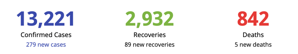
Their “fresh cases” today are up at 252 from 46 the previous night. The “late cases” (> 4 days into validation) is 338 for a grand total of 590 cases reported last night – lower than the yesterday’s 1046 but higher than the previous day’s 539. There were 8 deaths and 88 recoveries reported, bringing the case fatality rate to an all time low of 5.5%. Unfortunately, because of the higher number of confirmed cases (fresh or otherwise), the recovery rates have also been dragged down a low of 22.1%.

This change in the reporting system in order to address the backlog in data has sparked confusion, not only to the ordinary layman but to the medical community as well who’ve been constantly following the numbers in order to craft policies at the workplace (hospital or business) as the GCQ (general community quarantine) takes into effect tomorrow.

Unfortunately, it is what it is and we need to contend with what is in the Data Drop system.

Let’s the dissect the available data.

https://drive.google.com/file/d/1cDD9G8QKK_y5Bc3o6Pq5k4fXGYhkCVkx/view

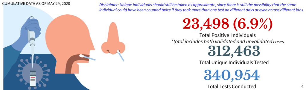
As of May 29, more than 340,000 tests have been conducted (+8138 tests done) in 312,463 (+7347) total unique individuals. Of the total number of individuals tested only 6.9% are positive. Or a total of 23,498 positive individuals (both validated and unvalidated cases). Since there are only 17,224 confirmed cases as of last night, there are around 6000+ missing positive patients. These may not necessarily be NEW confirmed patients but previously positive patients who have had repeat testing done, remained positive and are still up for repeat testing. It is also difficult to separate patients who have tests done in one facility and have repeat tests done in another facility. But since I am not privy on how information is collected for these patients, I am speculating that this may be a problem that the health agency is plagued with. Validating this kind of information is labor intensive and leaves no room for human error. Elaborating on this discrepancy by the agency should allay the public’s fear of why the numbers have recently gone up.

Consistency and accuracy in data is vital to any report or pronouncement by the agency.

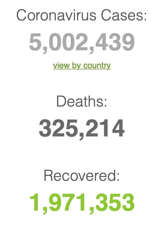
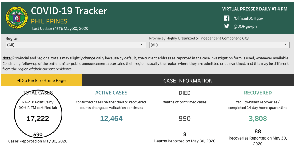
When they announce a total of 17,224 cases in their summary press release last night and yet in their own website announce this, you know that we have a problem even in validating the official information that is dished out by the agency.

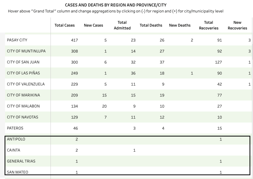
Of the 252 “fresh cases” and 338 “late cases”, 162 and 218, respectively came from the National Capital Region. This makes a total of 380 cases from the NCR alone (fresh or otherwise). There is no breakdown on which are fresh or late but of the 380, 236 (62%) are still for validation. Those validated are: Caloocan City (27), Manila (20), Malabon (20), Marikina (15), Quezon City (12), Navotas (7), San Juan (6); Valenzuela, Pasay City, Pasig, and Makati with 5 each; Taguig (3); Parañaque (2), and 1 apiece for Las Piñas and Muntinlupa.

What I don’t get is how these places got included in the NCR as separate cities.

Region VII reported 18 fresh cases. There were no late cases reported. The only conclusion one can make from this is that (a) there’s no backlog in the Region VII data and (b) all the data yesterday – 11 from Cebu City and 7 from Mandaue are within the three days window.

The 9 reported repatriates are all late data (> 4 days ago).

The remaining 183 (72 fresh and 111 late) are a basket of information where you cannot discern which are “fresh” and which are considered “late”.

Region IV-A for example has 29 data for validation while those with reports are from Rizal (4), Laguna (1), Cavite (4).

Region III (Central Luzon) has 4 for validation with confirmed reports from Bulacan (5), Bataan (1).

Region VI reported 1 apiece from Iloilo Province, Antique and Bacolod City.

Region I had 1 case from Pangasinan and 2 from La Union.

The Bicol Region (Region V) has 4 cases for validation but reported 1 from Albay and 1 from Camarines Sur.

Region IX reported 1 case from Zamboanga City.

Region II (Cagayan Valley) reported 1 from Isabela.

Region IV-B (MIMAROPA) have 2 cases for validation still.

Region XII has 1 reported case from General Santos City.

And there are 117 cases for validation from – well, your guess is as good as mine.

I am surmising (again) that these for validation (for validation) are probably patients without tagged residences. Again, as to why there is no information on them needs to addressed by the health agency. Perhaps informing the local government RESU on the completeness of the documents submitted to them should be the rule rather than the exception. Actually, for awhile there, the Department of Health was able to consistently provide almost 100% tagged residences especially during late April to mid-May.

Finally there is the BEAT COVID informatics they provide. While there is a wealth of information there, the barrage in information that may not be totally relevant to the public is difficult to keep up with.

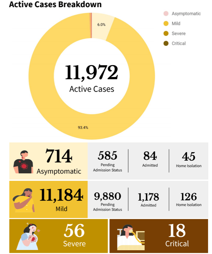
For example, under case breakdown of ACTIVE CASES as of May 29, it is good to know that most the active cases are actually mild (93.4%) and that the asymptomatic comprise only 6% of the total cases. As of this date, 56 have severe illness and 18 are critical.

In the same Philippine Situationer https://drive.google.com/file/d/1cDD9G8QKK_y5Bc3o6Pq5k4fXGYhkCVkx/view, I get confused at the available beds and mechanical ventilators dedicated to COVID-19 cases.

If there are only 18 critical (let’s even throw in the 56 severe) cases among the active cases, why are 358 mechanical ventilators in use and 463 ICU beds occupied? This is under the heading of Hospital Beds and Mechanical Ventilators Dedicated to COVID-19 CASES!

While I can feel how overwhelmed the health agency is, pointing out these inconsistencies is intended to make them aware that people are following them. After all, who else can we trust our health if not from our health agency?

Integrity of data is vital to every healthcare system. After all, it is the basis of policies made by the government.

Bending the curve: are we flattening it?

There are two terms that are used complementary to one another to determine if a country has the pandemic under control.

Bending the curve refers to the graphical representation that the number of daily cases is plateauing and later on sees a continuous decline in the trajectory of the curve.

Figure 1. Are we bending the curve?
https://www.biospectrumasia.com/analysis/83/15734/covid-19-are-countries-bending-the-curve.html

Figure 1 above illustrates the current condition of various countries based on days since the first cases reached 30/day (X axis) and the number of cases (in logarithmic scale, Y-axis). One can see that there are countries that are still on an upward trajectory while others have begun to bend (slightly or significantly) their curves.

Has the Philippines bent its curve?

Figure 2. Daily confirmed deaths due to COVID-19 (United States, Italy, Indonesia, the Philippines, South Korea, and Brazil)
Figure 3. Daily vs total confirmed deaths due to COVID-19 (in red is the United States). Other countries illustrated include Brazil, Italy, South Korea. Indonesia and the Philippines.
https://ourworldindata.org/covid-deaths

Figures 2 & 3 above show how we are faring. And while the United States may have the most cases in the world, they have also begun to bend the death curve with less daily deaths vs total confirmed cases as well. Brazil on the other hand is the new epicenter in the world to watch out for as its death rates begin to climb staggeringly. Indonesia still has an upward trajectory for deaths (in proportion to their upward trajectory in cases, see Figure 6 below).

The other term used by epidemiologists is more commonly known as “flattening” the curve. Let me delve on this a bit as this has caused some confusion among the public.

Figure 4. Illustration of the concept of flattening the curve. https://www.livescience.com/coronavirus-flatten-the-curve.html

Flattening a curve does not imply that the curve should flatten to ZERO. It is a misconception among lay that a curve in order to be called “flattened” is pressed to the ground.

In a pandemic, the curve varies in shapes from country to country, with some countries taking a steeper climb than others. As a general rule, when a country has a steeper rise in cases (more people get infected), it will also have a steep fall (the patients either get better or die because the virus has infected a large segment of the population already).

A steep rise in cases carries a large burden on the health system. Too many sick people overwhelm the healthcare system and overloading beyond the capacity to treat people results in greater death rates. More people die not only because there are no more hospital beds, but the overall health system – from healthcare workers to basic supplies – are exhausted rapidly.

Interventions like the ECQ and social distancing, hygiene, wearing masks and other ways at minimizing the transmissibility of an infection from one person to another (i.e.. school closure, limiting travel and work, closing borders and minimizing movements) are ways to flatten the curve. A flatter curve does not mean that we pummel the curve to the ground (although wouldn’t that be great?). When we flatten the curve, we slow down the infection rate. It assumes that the same number of people eventually get infected, but over a longer period of time. Slowing down the infection de-stresses the health care system.

That’s the story of the COVID-19.

There is currently no vaccine or drug to treat this disease and we’re all scrambling at the availability (or unavailability) of testing. The collective action of everyone in the community is needed in order to address the challenge of seeing a decline in the cases of COVID19.

Have we flattened our curve?

Figure 4 above illustrates the health care capacity of a country in the broken lines. Without precautions during a pandemic, the number of people infected would be disproportional to the health care capacity resulting in a direct collapse of the health system and indirectly leading to more deaths. The “flatter curve” (in orange hue) has the same area under the curve (number of patients) but spread out over a period of time when compared to the more steep curve (in dark pink when no precautions are observed).

Figure 5. Image from the CDC and criteria for claiming “flattening of the curve”

There are two major criteria (shown in figure 5) to say that the curve has flattened. (1) Slow acceleration of number of cases, and (2) reduction in the peak number of cases and related demands on hospitals and infrastructure. I would boldly venture on saying that the overall reduction in death rate is an ideal parameter to indicate that we’ve reduced the demand on hospitals and infrastructure.

https://www.doh.gov.ph/covid19tracker

As of May 20, 2020, the DoH reports that facility capacity of various hospitals in the Philippines is not overwhelmed. Only 34.5% of total ICU beds and 17.8% of mechanical ventilators are being used.

The death rates have also dramatically dropped weekly. From April 26 – May 2, the average deaths was 16/day. May 3 – May 9 showed an average of 15/day. May 10 – May 16 an average of 16/day. May 17 – May 23 show a dramatic drop to 6/day.

Number of new confirmed cases are also on the decline. The last 4 weeks (since April 26) saw a 7 day average of 240 cases/day. To say that we’re slowing the acceleration of cases is to see a conservative decline by at least 10% from the average of the previous week. We ended last week with an average of 242 cases/day. I wanted to test the threshold of 225 cases/day for the week. THE 7 DAY AVERAGE FOR THE WEEK OF MAY 17-23 is 210!

With this new 7 day average for last week, we now test the threshold of 190 cases/day for the coming week. If this is sustained in spite of latent data, then we can confidently say that we have not only begun to, but we have flattened the curve. (This has to be something consistently seen over a 4 week period).

Figure 6. Daily vs Total confirmed COVID-19 cases (US, Italy, Philippines, Indonesia, South Korea and Brazil)

Figure 6 above shows the Philippines and the United States plateauing on cases, with Brazil now in an upward trajectory. A plateauing of cases means a slowing down in the trajectory (shifting the curve to the right). If we sustain at declining by 10% the weekly threshold, we will have similar bending curves as South Korea and Italy. While Indonesia may have lower death rates compared to the Philippines, its cases remain on an upward trajectory and have not plateaued yet.

Statistics for the day

The world is now at 5,328,548 confirmed cases with 340,425 deaths (6.39% case fatality rate) and 2,175,290 recoveries (40.8% case recovery rates). The ratio of recoveries to deaths is higher at 6.4:1.

Back home in the Philippines, the Department of Health has publicly announced 180 new cases, 85 new recoveries and 6 new deaths.

https://covid19stats.ph

Our case fatality rate has improved and is now down to 6.26% with recovery rates up at 23.06%. Globally we rank now lower in recovery rates at 140 (out of 165 countries), and are doing much better at number 30 (from number 29) in death rates.

The Department of Health website has not updated the Data Drop files as of this writing but reported that of the 180 new cases today, 114 (63%) are from the NCR while the remaining 66 (36%) are from others. The NCR remains to be a hotspot contributing to more than 60% of the daily cases reported in the Philippines.

Update (May 24, 2020)

Based on the DoH website this morning of the 114 cases in the NCR, Quezon City is back on top of the heap (25), followed by Manila (23) and Makati (16). The rest include: Caloocan City (15); Malabon (6); Marikina and Mandaluyong (5 each); San Juan (2); and Parañaque, Pasig, Taguig, Pasay City, Muntinlupa, Las Piñas and Pateros with 1 apiece. Only Navotas had no reported case yesterday. There were 9 cases for validation.

Of the remaining 66 cases, almost 60% was from Davao City alone with 38 new cases. The rest were from Rizal (4), Laguna (1), Cavite (5), Batangas (1), Quezon (1), Bulacan (3), Bataan (3), Nueva Ecija (1), Iloilo Province (1), Iloilo City (1), Baguio (1), Cagayan de Oro (1), Cotabato (1), Surigao del Norte (1) and the remaining were for validation.

Testing Capacity

https://www.doh.gov.ph/covid19tracker

As of May 22, 2020, a total of 287,294 tests have been done among 265,061 individuals with 20,264 testing positive (7.6% positivity rate). There were a total of 9,504 tests done yesterday alone (6% of who were positive). As of yesterday, there are 7,128 samples in the backlog.

Disclaimer: All information provided in the daily reports and updates are based on the Data Drop of the Department of Health website. The accuracy of information is dependent on the information released from the DoH. All other graphs, citations and projections are referenced appropriately. Any change in future data particularly on latency reporting may affect the overall trend cited in this post.

COVID-19 in the Philippines: The explanation

The wave

The pronouncement of the health secretary that we’re in our “second wave” in the pandemic deserves an explanation for why I disagree.

According to reports, the claim is based on the fact that the first infections and death seen in the archipelago was the first wave. To him it may make sense because we came from zero cases. The first three cases and the first death were interpreted by their epidemiologists as the first wave. If that argument were to hold water then every country that has not reported any case at the start has had its first wave already. As a matter of fact, we have overtaken China because Wuhan has not even declared a second wave. Nor has South Korea and Singapore, in spite of the minimal uptick in cases.

Which means that all 212 countries are in their second wave of the infection. A most likely unacceptable argument regarding the understanding of what epidemiological waves of diseases are. But let’s simplify it for clarity.

Figure 1. Temporal dimension of an epidemic

If you look at the above figure, let’s focus on the temporal dimension (time on the X axis). The cases are on the Y axis. The epidemic wave plots cases against time. During an epidemic the number of new cases increases rapidly to a peak then falls gradually till the epidemic is over.

The concept of epidemic wave helps describe the number of people affected by the disease (new confirmed cases) and the possibility that the course of the epidemic may be predictable. The reasons for many disciplines – from biology to mathematics to even economists – to become interested in the subject.

Figure 2. Cases and Deaths
http://pcwww.liv.ac.uk/epidemics/epidemic_wave.html

Figure 2 on the left above shows new cases. In red, it shows that the cases rise then gradually tapers off until the epidemic comes to an end with 0 cases. In blue is the cumulative number of cases. Notice that there are two X axes – on the outermost left is the number of new cases while on the outermost right the cumulative number of cases (overall total). As the new cases reach a peak and then begin to decline (in red), the cumulative cases plateau because there are no added cases (in blue).

Every case has an outcome. Either the infection is resolved or results in death. On the right side of Figure 2, you see deaths as the endpoint. The pattern for people dying from the disease is a bit different from the number of cases. Notice this time (in blue) that there are peaks and troughs in between. The swings mean that death is not constant.

Nevertheless, during the whole epidemic, as you see the number of cases decline, there is also a proportional decrease in mortality. When there are no more cases, there are also no more deaths.

Figure 3. Measles epidemics in various countries from 1945-1970

To get a clear understanding of an epidemic wave, Figure 3 above shows how waves from one disease alone – measles as an example – would differ from country to country. Some epidemics may occur annually (like the US) while it is more spaced apart for other countries like Denmark or even Iceland. Epidemic waves occur when public health measures are not properly instituted. Nevertheless, if you look at Figure 3, notice that these so-called “waves” have different peaks. Which means that after one outbreak is controlled, because of ongoing local transmission of the disease, another outbreak is likely to happen but not necessarily of the same magnitude.

Figure 4. Total daily confirmed cases PHILIPPINES
Figure 5. Daily confirmed deaths PHILIPPINES

Figures 4 and 5 show the number of daily confirmed cases and deaths in the Philippines. I am unsure where the basis of the first wave to the declaration of a second wave of infection lies. First of all, we have not even flattened the curve. So I don’t know what wave their epidemiologists are talking about. The number of daily new cases remain above 200 (in fact today we saw another rise above the 7 day average threshold last week of 242). But that cannot be faulted on actual cases reported because in reality, the latency of data is stupendous. Recoveries now take almost 10 days to report, while deaths more than 9 days. There are so many layers of validation that it’s so difficult to make heads or tails of the data. Are we or aren’t we doing better? In spite of the almost 2 1/2 months of community quarantine, we seem to not be gaining much headway in terms of new confirmed cases.

Perhaps the secretary of health should provide a clear explanation on his basis for saying we are actually in the second wave to allay public fears on how and when this second wave appeared. Because if indeed a first wave occurred when three cases occurred with one death way back in the end of January of early February, it goes back to the question – what did the agency do to mitigate this “first wave”? Should there not have been more aggressive measures recommended instead of having to wait for the tsunami that came along in March? And the fault for not having defused the first wave goes back to the agency.

Nevertheless, the good news is that we are actually seeing a slowing down in death rates. As I mentioned, every pandemic will have an endpoint – death or recovery. It is common sense that when there are no more cases, there will be no more deaths due to that infection. In the meantime, I defer to the other epidemiologists to provide an explanation of the so-called “second wave”. Personally, and I may be wrong here, we have not even flattened the curve.

In the interest of transparency, the health agency must reveal how much more backlog information they have and when the surprise reveal will be.

The curve has flattened (?)

Interestingly, an economist attempted at making sense of the data as well. In an article published by Rappler https://www.rappler.com/thought-leaders/261410-analysis-has-philippines-flattened-curve-coronavirus-pandemic?utm_campaign=Echobox&utm_medium=Social&utm_source=Facebook#Echobox=1589948202, there are two figures that make this analysis both truthful and disturbing.

The bar graph above shows the daily deaths reported (in blue) and the date they died (red). Which actually is what the reports of the DoH show (not considering that a lot of data is still latent). Hopefully we will not get surprise numbers in the end. And that the number of deaths continue to actually decline.

The second graph shows us data on hospital admissions. The dramatic decline in hospital admission is also a good sign that perhaps we’re not getting sicker patients. Less severe and less critically ill. Which means that the intervention of quarantine, social distancing, hygiene and PPE actually created a large impact on the number of patients requiring hospitalization. The more vulnerable patients stayed home. The general population was less at risk.

But to declare that we have flattened the curve based on these two parameters is not accurate from the medical point of view. The majority of cases we’re seeing now are asymptomatic or mild cases. As long as the number of new confirmed cases are up, there will always be risks to the community at large. Hence, it is disturbing that one cherry picks on data without looking at the over-all picture.

Let’s agree that there are gains being made in the challenging fight against this virus. But let’s have a more uniformed scientific approach by being cautious at what we predict and not be alarmist to a public that is already on the edge of their seats at this pandemic.

Then there’s the confusion on return to work requirements

If the twin confusion above was not enough for the day, there’s a statement from one of the advisers of the president that all the doctors do is to complain. Particularly on the use of the rapid testing kits.

For the record, while it may seem like a complaint to him, for those of us who know what we actually are doing and recommending, the use of rapid testing kits as a requirement for workers to return to work is not scientifically sound and adds up additional expenses to the employer for a tool that may not be at all that useful.

Figure 6. Diagnostic Tests in the Detection of SARS-CoV-2 infection.

Rapid diagnostic tests are antibody detection tests. Which means that while they may find some use in the latter phase of the infection after a quarantine period, it give you a false sense of complacency when patients get tested during the first 10 days of illness – during the incubation period. Most likely they will test negative EVEN if they have the virus.

To address the issue that all the doctors do is to complain, let me write down what I believe should be a sound recommendation.

  1. Nothing works as good as a good triage. In short you need to assign people who will check each and everyone (including the employer) for symptoms before they are allowed to work. This is because more than 80% of transmission of COVID19 are from patients who have symptoms. Always ask returning workers about a history of FEVER and RESPIRATORY SYMPTOMS in last 2-3 weeks. If they had a combination of these, test with RT-PCR if you suspect them to have COVID19. Keep them isolated for 2-3 weeks regardless of the RT-PCR result. If they turn out positive, then they need to be cleared based on the protocol of the Department of Health before they are able to return to work. If they test negative and have had no symptoms after being quarantined for the last 2-3 weeks, then they can return to work.
  2. I have not encountered any literature or recommendation on the ideal laboratory test to clear workers who have no symptoms for work. If you refer to Figure 6 above, a rapid antibody will be falsely negative in a patient who is incubating with the virus in the early part of the infection. If a patient has been asymptomatic for 2-3 weeks and test (+) IgG and (+) IgM it’s either the patient has had an infection and recovered or may have false positive results.
  3. If you do RT-PCR in a patient who doesn’t have symptoms, it may NOT be cost-effective to screen everyone considering the cost of doing RT-PCR. Besides, one negative test does not mean that the patient does not have the virus. After all, even RT-PCR will be negative in 1/3 of patients.
  4. Not all the antibody tests are the same. If a company decides on using them to screen their workers who come back to work, make sure that it’s a validated test kit. It does not mean that just because it is registered with the Philippine FDA, it has been validated already. Use kits that have high sensitivity and specificity. While these may be more expensive than some other kits, precision is a price worth paying for.

The takeaway message is that this virus will be with us for quite awhile and yes the economy is hurting. That includes us, the doctors who practice and yet risk our lives to see patients who are sick.

Yet reality and practicality tells me that even if you test once and test negative, you can still get infected tomorrow or anytime in this pandemic. Because it isn’t over yet. And the numbers tell us that we’re nowhere near a flattening of the curve.

While testing has its use and may be part of the solution, it also has its limits. Let us use these tests judiciously at the same time without having to burden employers with additional costs for something that may not have much cost-benefit in the end. Moving forward, really need a paradigm shift in the way we live, work and play.

The Brief

As predicted in the world:

https://www.worldometers.info/coronavirus/

Back home:

https://covid19stats.ph/stats

Our case fatality rate is lower at 6.37% (we now rank 28 of 163 countries in deaths) compared to the global average of 6.5% and the ASEAN average of 2.43%. Our case recovery rate is also up at 22.2% ( we still rank lower at 134 out of 163 countries) compared to the global average of 39.4% and the ASEAN average of 40.7%.

The site of the Department of Health is down as of this writing so we cannot verify the additional information that they released. Nevertheless, I’m posting what they announced. We had a jump in new confirmed cases up now at 279 with 150 (54%) from the NCR, 14 from Region 7 (5%) and 115 from others (41%).

[After this explanation, we go back to THE BRIEF tomorrow.]