The wave
The pronouncement of the health secretary that we’re in our “second wave” in the pandemic deserves an explanation for why I disagree.
According to reports, the claim is based on the fact that the first infections and death seen in the archipelago was the first wave. To him it may make sense because we came from zero cases. The first three cases and the first death were interpreted by their epidemiologists as the first wave. If that argument were to hold water then every country that has not reported any case at the start has had its first wave already. As a matter of fact, we have overtaken China because Wuhan has not even declared a second wave. Nor has South Korea and Singapore, in spite of the minimal uptick in cases.
Which means that all 212 countries are in their second wave of the infection. A most likely unacceptable argument regarding the understanding of what epidemiological waves of diseases are. But let’s simplify it for clarity.

If you look at the above figure, let’s focus on the temporal dimension (time on the X axis). The cases are on the Y axis. The epidemic wave plots cases against time. During an epidemic the number of new cases increases rapidly to a peak then falls gradually till the epidemic is over.
The concept of epidemic wave helps describe the number of people affected by the disease (new confirmed cases) and the possibility that the course of the epidemic may be predictable. The reasons for many disciplines – from biology to mathematics to even economists – to become interested in the subject.

http://pcwww.liv.ac.uk/epidemics/epidemic_wave.html
Figure 2 on the left above shows new cases. In red, it shows that the cases rise then gradually tapers off until the epidemic comes to an end with 0 cases. In blue is the cumulative number of cases. Notice that there are two X axes – on the outermost left is the number of new cases while on the outermost right the cumulative number of cases (overall total). As the new cases reach a peak and then begin to decline (in red), the cumulative cases plateau because there are no added cases (in blue).
Every case has an outcome. Either the infection is resolved or results in death. On the right side of Figure 2, you see deaths as the endpoint. The pattern for people dying from the disease is a bit different from the number of cases. Notice this time (in blue) that there are peaks and troughs in between. The swings mean that death is not constant.
Nevertheless, during the whole epidemic, as you see the number of cases decline, there is also a proportional decrease in mortality. When there are no more cases, there are also no more deaths.
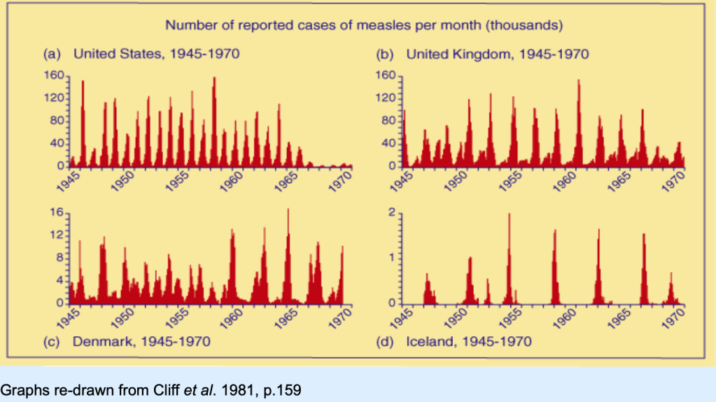
To get a clear understanding of an epidemic wave, Figure 3 above shows how waves from one disease alone – measles as an example – would differ from country to country. Some epidemics may occur annually (like the US) while it is more spaced apart for other countries like Denmark or even Iceland. Epidemic waves occur when public health measures are not properly instituted. Nevertheless, if you look at Figure 3, notice that these so-called “waves” have different peaks. Which means that after one outbreak is controlled, because of ongoing local transmission of the disease, another outbreak is likely to happen but not necessarily of the same magnitude.
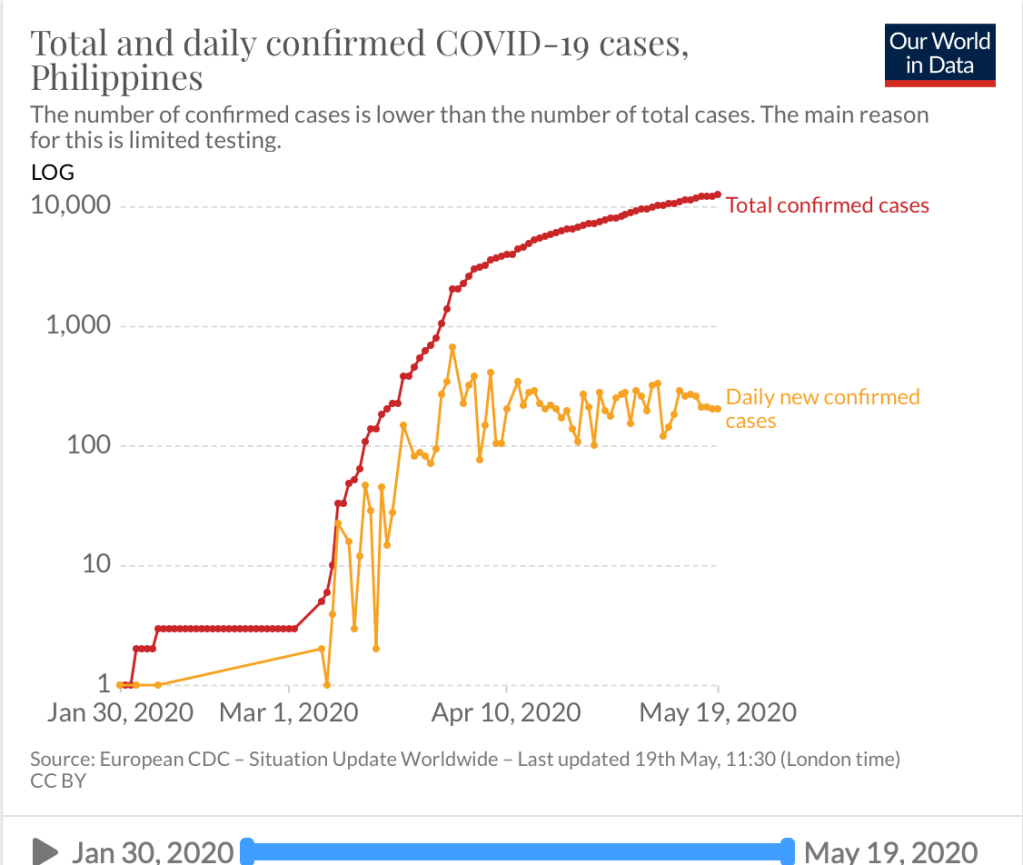
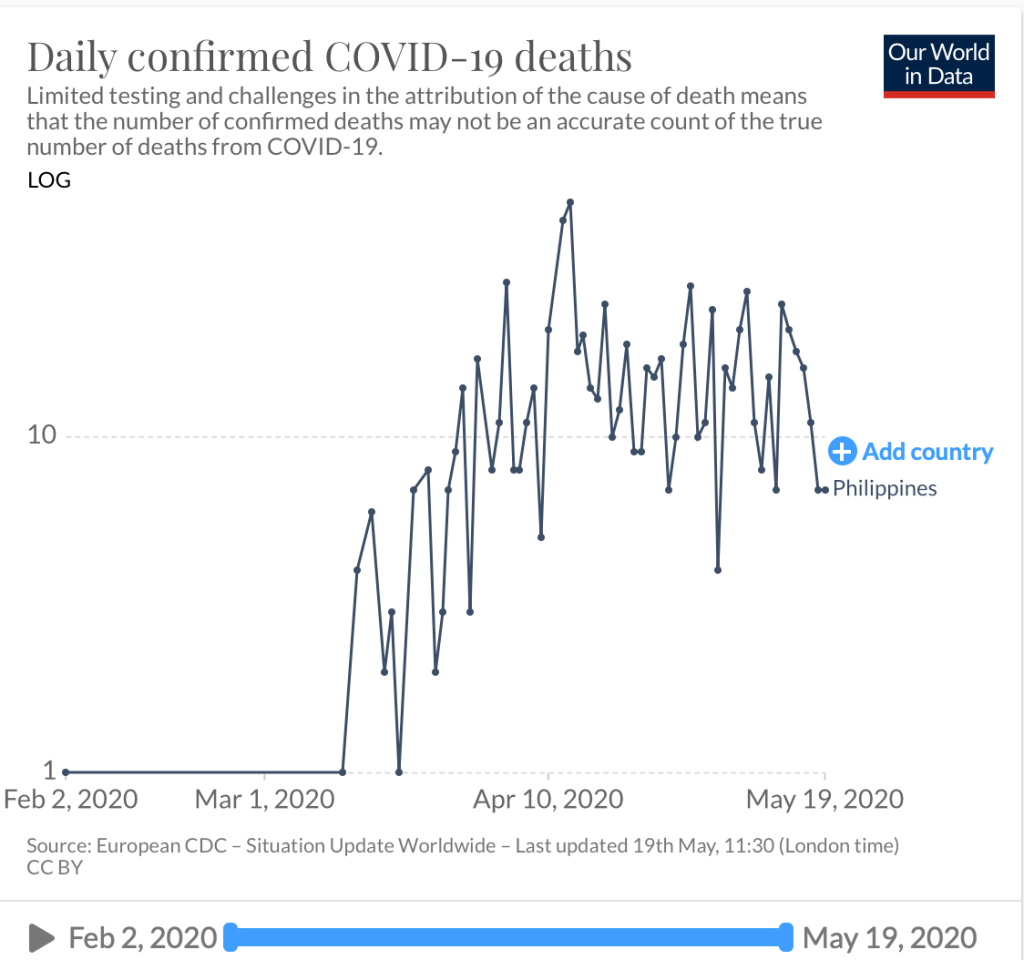
Figures 4 and 5 show the number of daily confirmed cases and deaths in the Philippines. I am unsure where the basis of the first wave to the declaration of a second wave of infection lies. First of all, we have not even flattened the curve. So I don’t know what wave their epidemiologists are talking about. The number of daily new cases remain above 200 (in fact today we saw another rise above the 7 day average threshold last week of 242). But that cannot be faulted on actual cases reported because in reality, the latency of data is stupendous. Recoveries now take almost 10 days to report, while deaths more than 9 days. There are so many layers of validation that it’s so difficult to make heads or tails of the data. Are we or aren’t we doing better? In spite of the almost 2 1/2 months of community quarantine, we seem to not be gaining much headway in terms of new confirmed cases.
Perhaps the secretary of health should provide a clear explanation on his basis for saying we are actually in the second wave to allay public fears on how and when this second wave appeared. Because if indeed a first wave occurred when three cases occurred with one death way back in the end of January of early February, it goes back to the question – what did the agency do to mitigate this “first wave”? Should there not have been more aggressive measures recommended instead of having to wait for the tsunami that came along in March? And the fault for not having defused the first wave goes back to the agency.
Nevertheless, the good news is that we are actually seeing a slowing down in death rates. As I mentioned, every pandemic will have an endpoint – death or recovery. It is common sense that when there are no more cases, there will be no more deaths due to that infection. In the meantime, I defer to the other epidemiologists to provide an explanation of the so-called “second wave”. Personally, and I may be wrong here, we have not even flattened the curve.
In the interest of transparency, the health agency must reveal how much more backlog information they have and when the surprise reveal will be.
The curve has flattened (?)
Interestingly, an economist attempted at making sense of the data as well. In an article published by Rappler https://www.rappler.com/thought-leaders/261410-analysis-has-philippines-flattened-curve-coronavirus-pandemic?utm_campaign=Echobox&utm_medium=Social&utm_source=Facebook#Echobox=1589948202, there are two figures that make this analysis both truthful and disturbing.

The bar graph above shows the daily deaths reported (in blue) and the date they died (red). Which actually is what the reports of the DoH show (not considering that a lot of data is still latent). Hopefully we will not get surprise numbers in the end. And that the number of deaths continue to actually decline.

The second graph shows us data on hospital admissions. The dramatic decline in hospital admission is also a good sign that perhaps we’re not getting sicker patients. Less severe and less critically ill. Which means that the intervention of quarantine, social distancing, hygiene and PPE actually created a large impact on the number of patients requiring hospitalization. The more vulnerable patients stayed home. The general population was less at risk.
But to declare that we have flattened the curve based on these two parameters is not accurate from the medical point of view. The majority of cases we’re seeing now are asymptomatic or mild cases. As long as the number of new confirmed cases are up, there will always be risks to the community at large. Hence, it is disturbing that one cherry picks on data without looking at the over-all picture.
Let’s agree that there are gains being made in the challenging fight against this virus. But let’s have a more uniformed scientific approach by being cautious at what we predict and not be alarmist to a public that is already on the edge of their seats at this pandemic.
Then there’s the confusion on return to work requirements
If the twin confusion above was not enough for the day, there’s a statement from one of the advisers of the president that all the doctors do is to complain. Particularly on the use of the rapid testing kits.
For the record, while it may seem like a complaint to him, for those of us who know what we actually are doing and recommending, the use of rapid testing kits as a requirement for workers to return to work is not scientifically sound and adds up additional expenses to the employer for a tool that may not be at all that useful.

Rapid diagnostic tests are antibody detection tests. Which means that while they may find some use in the latter phase of the infection after a quarantine period, it give you a false sense of complacency when patients get tested during the first 10 days of illness – during the incubation period. Most likely they will test negative EVEN if they have the virus.
To address the issue that all the doctors do is to complain, let me write down what I believe should be a sound recommendation.
- Nothing works as good as a good triage. In short you need to assign people who will check each and everyone (including the employer) for symptoms before they are allowed to work. This is because more than 80% of transmission of COVID19 are from patients who have symptoms. Always ask returning workers about a history of FEVER and RESPIRATORY SYMPTOMS in last 2-3 weeks. If they had a combination of these, test with RT-PCR if you suspect them to have COVID19. Keep them isolated for 2-3 weeks regardless of the RT-PCR result. If they turn out positive, then they need to be cleared based on the protocol of the Department of Health before they are able to return to work. If they test negative and have had no symptoms after being quarantined for the last 2-3 weeks, then they can return to work.
- I have not encountered any literature or recommendation on the ideal laboratory test to clear workers who have no symptoms for work. If you refer to Figure 6 above, a rapid antibody will be falsely negative in a patient who is incubating with the virus in the early part of the infection. If a patient has been asymptomatic for 2-3 weeks and test (+) IgG and (+) IgM it’s either the patient has had an infection and recovered or may have false positive results.
- If you do RT-PCR in a patient who doesn’t have symptoms, it may NOT be cost-effective to screen everyone considering the cost of doing RT-PCR. Besides, one negative test does not mean that the patient does not have the virus. After all, even RT-PCR will be negative in 1/3 of patients.
- Not all the antibody tests are the same. If a company decides on using them to screen their workers who come back to work, make sure that it’s a validated test kit. It does not mean that just because it is registered with the Philippine FDA, it has been validated already. Use kits that have high sensitivity and specificity. While these may be more expensive than some other kits, precision is a price worth paying for.
The takeaway message is that this virus will be with us for quite awhile and yes the economy is hurting. That includes us, the doctors who practice and yet risk our lives to see patients who are sick.
Yet reality and practicality tells me that even if you test once and test negative, you can still get infected tomorrow or anytime in this pandemic. Because it isn’t over yet. And the numbers tell us that we’re nowhere near a flattening of the curve.
While testing has its use and may be part of the solution, it also has its limits. Let us use these tests judiciously at the same time without having to burden employers with additional costs for something that may not have much cost-benefit in the end. Moving forward, really need a paradigm shift in the way we live, work and play.
The Brief
As predicted in the world:
Back home:
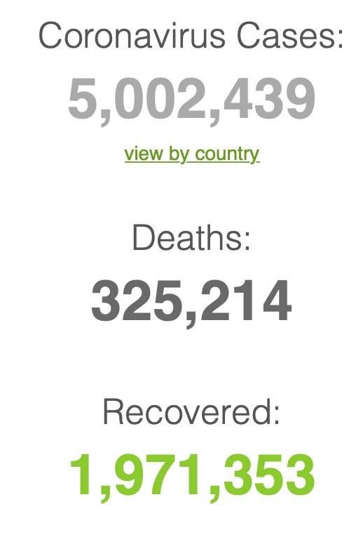
Our case fatality rate is lower at 6.37% (we now rank 28 of 163 countries in deaths) compared to the global average of 6.5% and the ASEAN average of 2.43%. Our case recovery rate is also up at 22.2% ( we still rank lower at 134 out of 163 countries) compared to the global average of 39.4% and the ASEAN average of 40.7%.
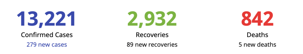
The site of the Department of Health is down as of this writing so we cannot verify the additional information that they released. Nevertheless, I’m posting what they announced. We had a jump in new confirmed cases up now at 279 with 150 (54%) from the NCR, 14 from Region 7 (5%) and 115 from others (41%).
[After this explanation, we go back to THE BRIEF tomorrow.]

Appreciate your clear explanation & analysis, Dr Benjie. Thanks a lot for doing this.
Keep safe !
Best regards to you, Bennie & your family
LikeLike
Appreciate your clear explanation & analysis, Dr Benjie. Thanks a lot for doing this.
Keep safe !
Best regards to you, Bennie & your family
LikeLike
Thank you for the enlightenment. Stay safe doc.
LikeLike
Thank you for this explanation. I agree with your analysis.
I hope we do realize now that the practice of public health is quite difficult and very much different from clinical practice.
We have a big problem but there are many solutions. They just need to be done in the right sequence and implemented seriously. Obviously we need to work together.
LikeLike
thank you for your comment as well and taking time to read the article. I completely agree that public health and clinical practice are two different worlds – but the same field. The takeaway message is that perhaps by being more circumspect in what is said in public is vital in every communication plan.
LikeLiked by 1 person
totally agree! Thanks Dr.
LikeLike
Thank you for your clarity and insight.
LikeLike
Thank you! This is well appreciated.
LikeLike
Thank you for the extensive explanation! God Bless & Keep safe
LikeLike
“The pronouncement of the health secretary that we’re in our “second wave” in the pandemic deserves an explanation for why I disagree.”
After reading that I felt I’m not just reading the views of a learned individual but that of a logical professional. I find your blog post on this matter far more agreeable than what Dr. Salvana wrote in Manila Bulletin or on a follow-up FB post he made – it seemed to be contrasting.
Thank you, Benjamin!
With the the commotion the 2019 Corona virus has stirred up, we can’t help some people not to pay more attention to the science of health and wellness.
A lecturer from Davao Doctor’s College, Mark Alipio wrote an article in SSRN looking into the Vitamin D levels and how it plays into mortality on COVID-19 based off data he got from DOH, which is something I can’t find btw. There was another study published in India and then I believe the US.
Apart from Vitamin D and the beneficial effects of UVB from the sun per the studies, there are a couple of articles published in the Lancet and JAMA or NEJM where they state that 40-60% of cells that get triggered in the immune response to fight the common flu is shared with SARS-COV-2 for those not exposed to the virus; another from Wuhan citing elevated LDL-C or was that LDL-P has shown “correlation” to higher rates of survivability compared to higher mortality for those with lower LDL.
Wuhan was among the first to publish data on Comorbidities; implying the tie in to COVID-19 and higher mortality apart from age as a factor and an individual being immunocompromised; data also suggest a 0.1% chance of a Metabolically healthy person dying from SARS-COV-2 infection. The DOH has stopped publishing data on the underlying health issues of people dying from COVID-19.
My ask is how does the Epidemiology world consider the role of and compute the growth rate for a disease besides CFR and IFR? Would looking into the Growth rates for cases and deaths on COVID-19 be another helpful metric to look at?
Also, what would Epidemiology do with these studies coming out and how it plays out with countries that did not implement lockdowns?
Lastly, US data on COVID-19 does consider comorbidity plus if the individual is obese. Are these additional metrics that can help shape the outlook on health and the approach to “sick care” through Epidemiology?
I could only hope to get replies or maybe read another blog post you’ll make on the concerns I’ve raised. 🙂
LikeLike
Thank you for reading my blog. Your questions deserve answers and I will one day write about it so that there’s a bit of understanding on these issues as well. Suffice it to say at this point, there are many unknowns so far and these make tracking the outcomes of this virus with certainty difficult. However, I’ve always said that we need to take COVID cases into the whole context. That means – in the overall healthcare system in the country, how has it impacted or affected us? Because at the end of the day, do the numbers justify the pandemonium?
LikeLike