It is a term used in economics and statistics to mean PER PERSON.
While it is most commonly used when comparing an economic metric to a population (like GDP and income per capita), it can be useful for all forms of statistical analysis that will require comparing metrics with varying population numbers.
Per capita information provides more granular data than just aggregate information. By using per capita, data is translated as being able to compare apples to apples between countries with different population sizes.
Yes. I’m referring to the coronavirus pandemic.
Worldometers, Johns Hopkins, the European Center for Disease Control, the World Health Organization, the New York Times and many other organizations and agencies rank the countries based on the total number of cases instead of per capita.
It’s interesting what the data looks like when we use per capita as the basis for mapping out cases and deaths in the pandemic.
To illustrate, we look at the cases and deaths due to COVID19 since the start of the pandemic in top 12 Asian countries.
Based on population, China has the highest number of people with over 1.4B, followed by Indonesia, Japan, the Philippines and Vietnam. The country with the smallest population in the region is Brunei with less than half a million people.
While Indonesia may have the highest number of cases to date (followed by the Philippines), based on population size, Singapore has the most number of cases per capita by a mile. Note that although it only reports close to 58,000 cases, it has less than 6M people in the nation giving them 9,873 cases per million population. China has more than 85,000 reported cases, but with more than 1.4B people, based on per capita, the country has around 60 cases/M population.

The same story can be told in deaths due to COVID19.
Indonesia has the most deaths in this part of the world – if we were just looking at total number of deaths. When the population is taken as a factor, based on per capita, the Philippines has the highest death rate due to COVID19 with 59 deaths/million population. China, that reported 4,362 deaths so far is all the way down in number 9 with a per capita or 3 deaths/million people.

In the same manner, when looking at local epidemiological data, notice how the Health Agency (and this blog) reports. Presentation of data is based on number of cases either by region or by city. It’s always easier to understand data if it is based on numerals easy for the general public to absorb.

If the above tables are rearranged according to per capita as shown in the table below, people will never understand why a city like San Juan that has only 3,224 cases is at the top of the list in cities with most coronavirus cases per million residents. The public don’t understand (or even know) that San Juan has only 122,200 registered residents making their per capita 26,397/million people. Notice that Quezon City and the city of Manila, while at numbers 1 and 2, respectively in the daily case count are not even in the top ten cities.
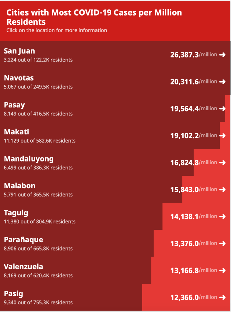
That’s because while Quezon City has more than 31,000 cases in its pocket, with a population of close to 3,000,000, its per capita is only 10,819/million population. The same story is seen in the City of Manila where in spite of the more than 21,000 cases to date, its population of almost 1.8M people make their per capita 12,000/million population.
Why then is data reported in terms of number of cases and deaths rather than per capita?
Countable running values (using addition and subtraction) are easiest to understand from a layman’s point of view. It also provides better information on control of transmission of the infection because values provided per capita are difficult to translate when it comes to control of infection in a particular locality. One cannot use per capita to determine whether various measures in the control of the pandemic are effective or not.
But the per capita perspective provides a clearer perspective on which countries are, or are not doing better in the pandemic.
The illustration below from the European CDC shows that the darker the hue of the blue color is, the more cumulative confirmed cases PER MILLION people there are in that particular country.

This next figure below shows the daily new confirmed COVID-19 cases per million population – another way of reporting per capita data. Here, there are two hues. One orange and the other purple. As the color approaches a more purple hue, then there are more cases being reported from that particular country.

On the perspective of having to compare apples versus apples, the per capita approach provides more accurate information.
Which means the Philippines leads overall in deaths in Southeast Asia, while Singapore leads in cases.
Apples to apples.
