I am a subscriber to the New York Times, And one of the go to sections of mine is the COVID-19 update – both in the US and globally.
So yes, the world isn’t counting the real numbers anymore. Not even in the United States of America. And this is by no means a sin. Testing strategies have changed. Other countries do not even report the true number of COVID-19 cases. Even the World Health Organization acknowledges this huge gap. With how COVID-19 has run the world in the past three years, everyone and yes, everyone is just sick and tired of seeing the numbers.
But when the numbers being announced are wrong because someone was just basing information on someone else, then that’s called fake news. The people in the New York Times probably wouldn’t give a sh*t to a blogpost from the Philippines about this. But it matters. It matters because you would expect a respectable newspaper to get the information right.
The data on COVID numbers for the New York Times is based on the data provided by Johns Hopkins. They have a disclaimer on that.
At their online site, it’s clear that the newspaper just obtains data from the Center of Systems Science and Engineering at Johns Hopkins University. The very same center the generates the information in https://ourworldindata.org. The link is provided here: https://ourworldindata.org/coronavirus#explore-the-global-situation.

Those responsible for the data at Johns Hopkins are:

The information gathered by Johns Hopkins are from the internet. Bluntly speaking, they are only dependent on the information that is published in the website of, say, the Department of Health. And when the DoH has a ‘glitch’ in publishing the right numbers, then what is churned out of Johns Hopkins and of course, the New York Times are wrong data.
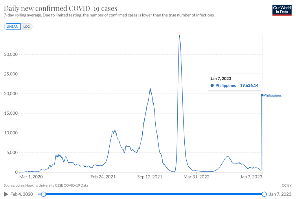
To date, the Philippines has not had a surge as published by Johns Hopkins and then culled and quoted by the New York Times.

So where is the error coming from?
Well, to start off with, the automated system (I suppose it is automated) in Johns Hopkins most likely looks at the total and deducts yesterday’s total cases with the one today. On January 3, the Department of Health announced a jump in the number of total cases in spite of the 174 additional new cases alone.


Based on the above infographic, the number of new added cases of 174 did not match the total cases, which had jumped from 4,065,173 to 4,200,225 or an addition of 135,052 cases overnight (from January 2 to 3).
Even on the premise that it could have been a pouring of backlog reports to achieve that number, (notice that the number of recovered had also jumped from 3.98 M cases to 4.12 M cases with a gradual decline in active cases), it would be mathematically improbable that there would be that many backlogs. Why?
Two reasons: (1) the Philippines averages 10-11,000 individual PCR tests daily. (2) positive rate is at 5.7%. Which means that even if we did 25000 tests a day (remember, we do not record antigen tests in this country), the most number of positive cases would likely be around 1400 (or even lower).
So why was the January 3, 2023 infographic wrong? Human error. Someone put the wrong data in and did not bother to look or discern the numbers.
As of yesterday, January 7, our numbers are back to reality – 4,067,170 total cases and 3.99M recovered.

Something which the New York Times or Johns Hopkins did not bother to correct. If they were using an automated tool, then that would have generated a negative number and we all know that the 7-day average of cases cannot be NEGATIVE. It’s either you have cases or you don’t.
But that’s what happens when data isn’t really analyzed. Garbage in is garbage out.
And that’s why I’ve stopped counting.
