Disclosure: All data provided are from the Department of Health’s various information sites including their data drop. Where appropriate, other graphs, illustrations, tables and data are appropriately referenced.
December 31, 2020 (updated)
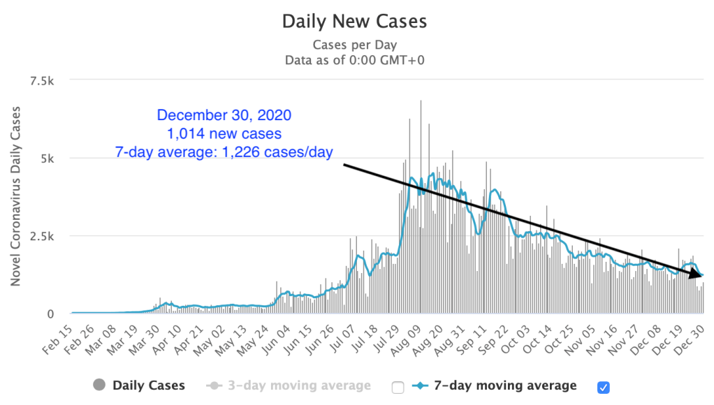
With the last day of 2020, the Health Agency announces 1,541 new cases and 14 deaths.
Two cities in Mega Manila – Quezon City (101 cases) and City of Manila (67 cases) – account for 11 percent of the total haul of the day.
Two other cities outside of NCR were among the top five – Baguio City with 79 cases and Davao City with 59.
There was only one province in the top five – Rizal, with 65 cases.
The year ender data shows that the total cases was 20 percent lower in December compared to November with 42,594 new cases for the month of December.
The number of deaths for the month of December was 45 percent lower than November with 479 new deaths in December.
Yesterday’s data breakdown
The Philippines
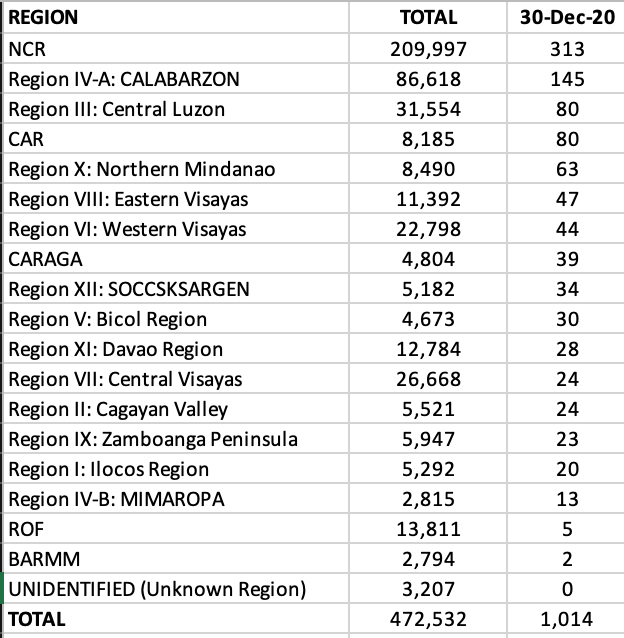
NCR reported 313 new cases, with Quezon City, Makati and the city of Manila contributing to 50 percent of the total cases yesterday.
Only one region outside of NCR had triple digits – CALABARZON.
Four provinces in Region IVA were among the top ten – Laguna, Rizal, Cavite and Batangas.
Benguet was the top hauler among the provinces with 71 cases.
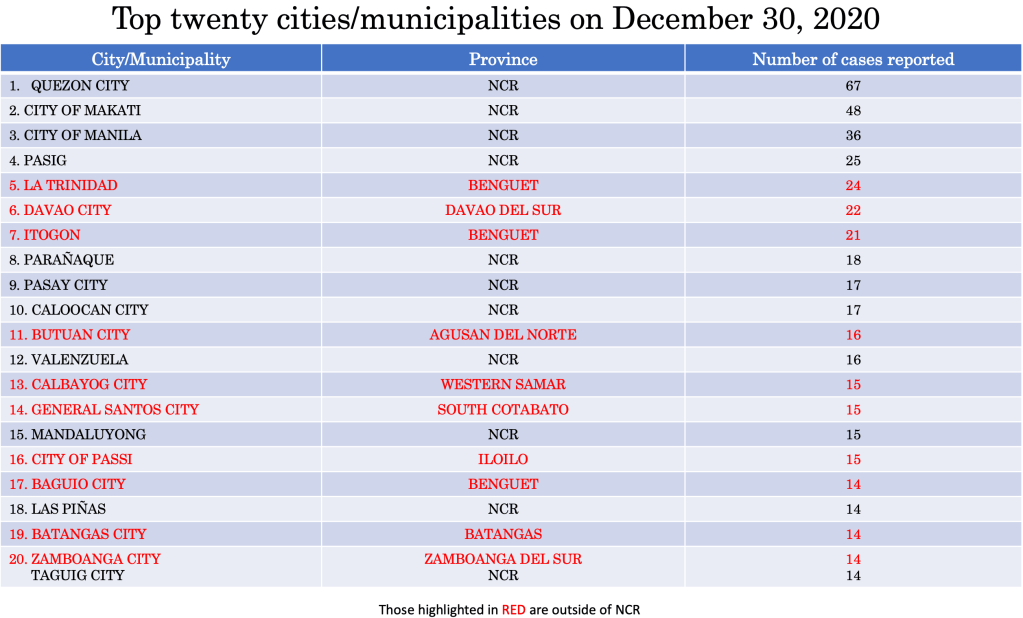
Eleven of seventeen cities in NCR were among the top twenty cities/municipalities with highest cases yesterday with Quezon City, Makati, City of Manila and Pasig City grabbing the first to fourth slots.
Three cities/municipalities in Benguet were in the top twenty – La Trinidad, Itogon and Baguio City.
THE WORLD
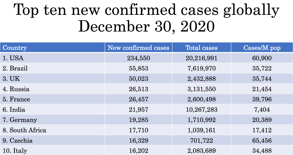
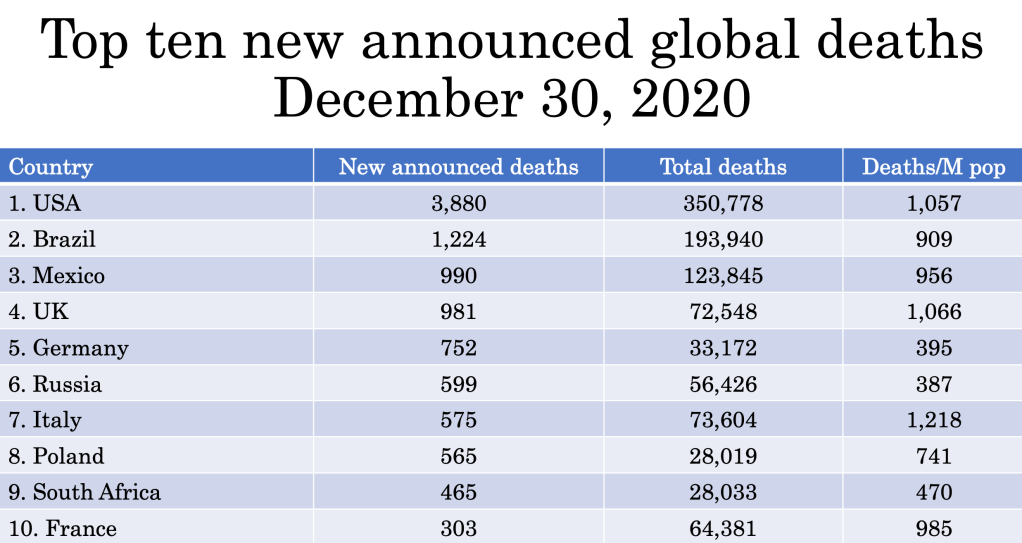
With 738,363 new cases and 15,192 new deaths globally yesterday, the world total quickly crosses the 83 million mark to close the year with more than 1.8 million deaths.
The United States continued to lead in new cases and deaths as it passed the 20 million mark for coronavirus cases and more than 350,000 deaths since the beginning of the pandemic.
Throughout history, as humans spread across the world, infectious diseases were constant companions. Even in this modern era, outbreaks are nearly constant. History, after all, is our greatest teacher. And lest we forget, this article provides some glimpse into the past (https://www.history.com) and how the coronavirus pandemic will end is still being written.
The rise in global connections and interaction remains to be a driving force behind pandemics.
Let’s look at the five worst pandemics in the world and their take away messages – how it ended.
First appearing in Egypt, the Justinian plague spread through Palestine and the Byzantine Empire, and then throughout the Mediterranean.
The plague changed the course of the empire, squelching Emperor Justinian’s plans to bring the Roman Empire back together and casting massive economic struggle. It is also credited with creating an apocalyptic atmosphere that spurred the rapid spread of Christianity.
The Plague of Justinian arrived in Constantinople, the capital of the Byzantine Empire in 541 CE, carried over the Mediterranean Sea from Egypt. Egypt was a recently conquered land by the Emperor Justinian and was paying tribute to the emperor in grain. Plague-ridden fleas hitched a ride in rats that snacked on the grain.
The plague decimated Constantinople and spread like wildfire across all continents and killed an estimated 30-50 million people (around half the world’s population).
Today, it is more commonly known as Bubonic Plague brought about by the bacterium Yersinia pestis. But the plague would not end here as recurrences over the next 200 years would be recorded.
How it ended? We don’t know but the best guess is that majority of the people in the pandemic somehow survived because they had some form of immunity.
Bubonic plague never really disappeared. Somewhere between 1347-1350 this disease which presents with enlarged lymphatic gland and chills and fever and later on gangrene of the extremities (toes, fingers, lips and tip of the nose) returned in Europe. During those years, there was still no treatment for this bacteria. And it was a painful way to die – with aches and extreme pain due to the decay and decomposition of the skin of the person while still alive. It claimed more than 200 million lives in just four years.
One-third of the world’s population was eliminated as this second large outbreak which started in Asia began moving west in caravans. It entered through Sicily, Italy in 1347 AD when plague sufferers arrived in the port of Messina and spread throughout Europe rapidly. Dead bodies became so prevalent that many remained rotting on the ground and created a constant stench in cities.
Because people still had no scientific understanding of the contagion, but knew that it had something to do with ‘proximity’, the Venetian-controlled port city of Ragusa decided to keep newly arrived sailors in isolation until they could prove they weren’t sick.
Trentino or 30-days forced isolation was implemented. But the Venetians were still seeing some cases in spite of the measure. They increased the forced isolation to 40 days or a quarantino – the origin of the word quarantine and the start of its practice in the Western world.
How did it end? The quarantine method was the beginning of a crude but effective way of isolating sick patients until they were no longer infectious – survived or died – from the disease.
In reality, London never really caught a break after the Black Death, with the plague resurfacing every 20 years from 1348 to 1665 – 40 outbreaks in 300 years.
In the early 1500s, England imposed the first laws to separate and isolate the sick. Homes stricken by plague were marked with a bale of hay strung to a pole outside. If someone among your family members was infected, you had to carry a while pole when you went out in public.
The bubonic plague led to a decimation of twenty percent of London’s population. With increasing human death tolls, mass graves appeared. To stifle the transmission of the fleas, hundreds of thousands of cats and dogs were slaughtered as the possible cause. The worst of the outbreak tapered off in the fall of 1666, after killing more than 100,000 Londoners in just seven months.
All public entertainment was banned and victims were forcibly shut into their homes (isolation) to prevent the spread of the disease. Red crosses were painted on their doors along with a please for forgiveness: “Lord have mercy upon us.”
How did it end? As cruel as it was to shut up the sick in their homes and bury the dead in mass graves, it may have been the only way to bring the last great plague outbreak to an end.
While smallpox was believed to have appeared around 10,000 BC, at the time of the first agricultural settlements in northeastern Africa, it is likely that it spread to India by means of ancient Egyptian merchants.
It has been reported in ancient Asian cultures as early as 1122 BC in China and is mentioned in ancient Sanskrit texts of India.
It was introduced to Europe between the 5th and 7th centuries and was frequently an epidemic during the Middle Ages. The disease greatly affected the development of Western civilization. The first stages of the decline of the Roman Empire (AD 108) coincided with a large-scale epidemic: the plague of Antonine, which accounted for the deaths of almost 7 million people. The Arab expansion, the Crusades, and the discovery fo the West Indies all contributed to the spread of the disease.
Unknown in the New World (meaning these people had zero immunity) , smallpox was introduced by the Spanish and Portuguese conquistadors. The disease decimated the local population and was instrumental in the fall of the empires of the Aztecs and the Incas. On the eastern coast of North America, the disease was introduced by early settlers leading to a decline in native population.
The discovery of the devastating effects of smallpox was the birth of “biological warfare”. During the French-Indian war (1754-1767), Sir Jeffrey Amherst, the commander of the British forces in North America, suggested the deliberate use of smallpox to diminish the American Indian population hostile to the British.
Another factor that contributed to smallpox in the Americas was the slave trade because many slaves came from regions in Africa where smallpox was endemic.
Smallpox or variola affected all levels of society. In Europe during the 18th century, 400,000 people died annually of smallpox and one third of survivors went blind. Otherwise called the “speckled monster” had devastating sequelae. The case-fatality rates varied between 20% – 60% and left most survivors with disfiguring scars. Among infants, the case-fatality rate was even higher – 80% in London and 98% in Berlin during the late 1800s.
Survivors of smallpox became immune to the disease and ended up tending to those subsequently became affected by it. Many herbal remedies were concocted, but the most successful way of combatting smallpox before vaccination was discovered was inoculation.
Inoculation involved the subcutaneous instillation of smallpox virus into people who had no immunity to it. The inoculator used a lancet wet with fresh matter from a ripe pustule of someone who suffered from smallpox. The material was the introduced subcutaneously on the arms or legs of the non-immune person. And this was not without its attendant risks – disseminated smallpox, spread of other individuals and transmission of diseases (syphilis was predominant during this era). This gave birth to the term variolation.
In Europe, where the medical profession was relatively organized, the new methods of variolation became known quickly among physicians. Since there was a demand for protection against smallpox, doctors began the variolation procedure on a massive scale. This was, however, not without adverse effects as 2% to 3% of variolated persons died from the disease, became the source of another epidemic, or suffered from other diseases transmitted by the procedure itself. Nevertheless, this became popular among both the aristocrats and common people in Europe and the case-fatality rate associated with variolation was 10 times lower than that associated with naturally occurring smallpox.
The long history of variolation had spread to North America and during the great epidemic of 1721, almost half of Boston’s 12,000 citizens contracted smallpox. The fatality rate for naturally contracted disease was 14%, whereas patients variolated by Boylston and Mather (Rev. Cotton Matter and Dr. Zabdiel Boylston) reported a mortality rate of only 2%. This was the first time that comparative analysis was used to evaluate a medical procedure.
As variolation became an acceptable method of prevention of the disease, it was rapidly adopted in Europe. In spite of the skepticism from British physicians after Mather’s success, it was subsequently adopted in England and spread from there throughout Western Europe.
In 1757, an 8-year old boy was inoculated with smallpox in Gloucester – one of thousands of children inoculated that year in England. The procedure was effective, as the boy developed a mild case of smallpox and became immune to the disease.
His name – Edward Jenner.
How did it end? Dr. Edward Jenner is credited for the discovery of the smallpox vaccine. Jenner’s interest in the protective effects of cowpox began during his apprenticeship with George Harwicke. For many years, he had heard the tales that dairymaids were protected from smallpox naturally after having suffered from cowpox. He concluded that cowpox not only protected against smallpox but also could be transmitted from one person to another as a deliberate mechanism of protection. In May 1796, Edward Jenner found a young dairymaid, Sarah Nelms, who had fresh cowpox lesions on her hands and arms. Using the matter from Nelms’ lesions, he inoculated an 8-year old boy, James Phipps. The boy developed mild fever and a discomfort in the axillae. Nine days after the procedure he felt cold, lost his appetite but on the next day he was much better. In July 1796, Jenner inoculated the boy again, this time using matter from a fresh smallpox lesion. No disease developed and Jenner concluded that protection was complete.
While the scientific community was skeptical with this discovery of Jenner (it was initially rejected by many physicians and scientists), those that did introduced the vaccine (as the term vaccination – latin word for cow is vacca and cowpox is vaccinia, Jenner decided to call this new procedure vaccination) among their patients and those willing to get protected against the disease.
Although Edward Jenner received worldwide recognition and many honors, he made no attempt to enrich himself through his discovery. He actually devoted so much time to the cause of vaccination that his private practice and personal affairs suffered severely. However, he not only received honors but also found himself subjected to attacks and ridicule. Despite all this, he continued his work of behalf of the vaccination program and eventually, vaccination replaced variolation, which became prohibited in England in 1840.
In the 1950s a number of control measures were implemented, and smallpox was eradicated in many areas in Europe and North America. The process of worldwide eradication of smallpox was set in motion when the World Health Assembly received a report in 1958 of the catastrophic consequences of smallpox in 63 countries. In 1967, a global campaign was begun under the guardianship of the World Health Organization and finally succeeded the eradication of smallpox in 1977.
On May 8, 1980, the world never saw a case of smallpox ever again. It was and still is the only virus ever eradicated in the world with the use of a vaccine.
During the 19th century, cholera spread across the world from its original reservoir in the Ganges delta in India. Six subsequent pandemics killed millions of people across all continents. The seventh and last pandemic started in South Asia in 1961, and reached Africa in 1971 and the Americas in 1991. Cholera is now endemic in many countries.
The prevailing scientific theory of the day said that the disease was spread by foul air known as “miasma”. It was third pandemic (1852-1859) that was the deadliest. It devastated Asia, Europe, North America and Africa, killing 23,000 people in Great Britain alone in 1854, the worst single year of cholera.
In that year, British physician John Snow, considered one of the fathers of modern epidemiology, carefully mapped cholera cases in the Soho area of London, allowing him to identify the source of the disease in the area – CONTAMINATED WATER FROM A PUBLIC WELL PUMP.
Snow convinced officials to remove the pump handle so that people could not drink the well, immediately dropping the cholera cases in the area.
How did it end? The birth of the sleuthing world of epidemiology and public health addressed measures at improved water supplies, public health and sanitation and quarantine.
Today, vaccination and antimicrobial treatment had decreased the morbidity and mortality of cholera, although there are still outbreaks worldwide (in 2017 in Somalia and Yemen) and until health and sanitation remains a problem in poorer countries in the world, this disease will remain in our midst.
The list of pandemics enumerated is not exhaustive.
And neither is it exclusive. Which means that some pandemics are worse because of ongoing diseases and timeline overlap from one disease to another.
As the world goes through an unknown, formidable virus in modern-day 21st century, it is important to recall the lessons of various history of pandemics. There are take away lessons here and we need to do our share in making sure that human lives do not end up as mere statistics of history.
How will the coronavirus pandemic end? Only history will tell its story.
There is a saying that goes “it’s hard to teach an old dog new tricks“.
And there’s no better situation to apply that saying than today – the COVID-19 pandemic in our midst.
When the various phases of the enhanced community quarantine begins to ease up, the question is – when do we go back to our “usual” normal lives?
By nature, every animal is a social being. Even the lowest form of animal engages in some kind of social interaction. From time of conception, our interaction with another life form is deeply ingrained with the attachment of that umbilical cord. Growth and neurodevelopment milestones are dependent on human interaction with both the environment and other beings in our midst. Humanity evolves because of social interaction and adaptive behavior.
It’s difficult for anyone to even imagine living in a world where the new norm means having to don a face mask each time you step out of your home, stay a meter away from another person, and avoid crowds and other social gatherings.
The last decade saw the boom of social media. Where friends were virtually in touch with one another through Facebook. Or where one’s opinion was simply Tweeted into the air. Or where food and travel places were Instagrammable. Where likes and shares were the norm rather than the exception.
As we were just getting settled into planning our annual vacations, post our successes and failures, and organize our future – a lowly respiratory virus perturbs our social milieu.
So how do we gradually settle into the “new normal”?
I guess the ‘no brainer’ here is we start by changing our daily routine. There are things we do that put us at highest risk in catching the virus. Knowing the extent of risk can help workplaces, schools and homes adjust activities of daily living to help us lower our risk to getting exposed to it. After all, it will be quite awhile before we get to see a vaccine or treatment (if there ever will be one).
On an individual capacity, we should decide for ourselves which places we should avoid and which ones pose little risk of getting infected from the virus.
There are basically five factors when it comes to risk assessment: (1) indoor or outdoor activity, (2) exposure time, (3) how likely we are to comply with the risk presented, (4) social distancing, and (5) personal risk level.
As a general rule, activities outdoors are generally safer because the virus does not get recirculated especially when the space you converge in is large.
Activities that don’t allow social distancing are riskier. Because the infection is acquired from droplet transmission. Activities that involve singing and shouting should be avoided for the meantime.
Exposure time is an important factor as well. Casually walking by a person along the street who may be infected with the virus is less risky than being seated beside someone in the mall or coffee shop the next 2 hours waiting for your friend to arrive.
Then there’s the risk on a personal level. If you know you belong to the vulnerable group (have comorbids or health risks that make you susceptible to getting infected), you should know better than anyone else on what steps to take.
Assign a score between 0-2 for each of the factors provided. 0 meaning no risk, 1 for intermediate risk and 2 for highest risk. Add up the factors with the scores and anything that puts you between 0-3 should be lowest risk, 4-7 as intermediate risk and 8-10 for highest risk.
Barsand Brothels
Now that’s a definite 10. And it’s worse if there’s even smoking, vaping and a lot of socializing. Who’s even going to bother wearing a mask inside a bar?
Adding the strippers and those gyrating men and women in scanty clothing (wearing a mask?) isn’t really the kind of stuff people trek to watch.
When the crowd gets rowdy, and they definitely will with all that booze and most likely drugs, that’s enough to become loose to keep your guard down.
It’s not only COVID-19 that you’re going to catch in a brothel, it’s more likely that you’re bound to even get pathogens that are sexually transmissible. Either ways – you’re going to die faster.
Concerts
Not too sure with anyone who’s willing to pay P100,000 to see someone sing and dance because the 10,000 seater venue can only allow 1,000 people -seated 2 seats apart on the side and two seats apart front and back.
But that would defeat the purpose of having the performer even get a standing ovation from a jam-packed audience all wearing a face mask. Or have a jam-packed audience rub arms, elbows, crotches and butts against each other singing, screaming and gyrating to the music and the show.
Definitely a risk level of 10.
Sports (and Gyms)
Definitely a no-no when you’re going to be splattering saliva and sweat against each other. So gyms for that matter should remain closed for the time being unless you can make sure that you allow only 3-5 people at a time (which is impossible to do) and that people are limited to working out by appointment and at a designated time limit (1 hour maximum) instead of parking their whole day inside the gym.
Reopening the gym will be a nightmare considering that you will have less manpower (gym instructors) and will need to make sure that all the equipments are cleaned after very gym rat uses it. But that’s hard to do because some of them jump from one equipment to another and then back to the same equipment for a routine for the chest, the back, the legs, the arms, the trapezius muscles….and cleaning up with sodium hypochlorite after every person using that piece of metal is potentially toxic.
And those spin, Yoga and Zumba classes will need to go for awhile. If you need to burn those calories, walking/running outside is healthier than doing it on the indoor treadmill (which is probably located less than a meter from the next treadmill in a 200 sqm size gym).
Anything that will require huffing and puffing for the whole duration of the activity will need to stay closed for awhile, unless you can make sure that the place is immaculately clean.
But let me put that in another context. If you won’t allow your kids to go to a park to mingle with other children who run around in the wild, or take your children to Fun Ranch because you’re afraid of who had the last touch on that slide, then the gym is the equivalent for the big boys (and girls) . For gyms, I’d give it anywhere between 8-10. Depending on several factors how they’d probably assure that there’s never going to be a crowd or that every piece of equipment is going to be cleaned down after every use or that there will be limited use and access by every customer or that the locker rooms won’t even have fomites and will be kept to a distance between one user and the next.
Any contact sports is definitely out of the reopening bid. Basketball, wrestling, volleyball, football, soccer, rugby, martial arts, boxing…they should be in park-mode for the meantime as they are a definite 10!
Sports activities in open spaces where people are far apart from one another (golf and outdoor or open-space tennis) carry very low risk. As long as socializing is not within the agenda, then it should pose a risk between 0-3.
Swimming is controversial. That would depend on how close you probably are to the next person. As a general rule, if you have a pool at home, swim there. If you want to use a public pool, then that would entail risks depending on how large the pool is and how many people are in the pool that given day. Even if the pool is chlorinated, you cannot help when people splatter saliva and blow air bubbles after several laps. Because we don’t know how SARS-CoV-2 is transmitted when swimming, it’s best that if and when we need to swim, consider swimming in a more open space like the sea or ocean. Of course, the ideal would be if you had a private beach…and that would put the risk to totally ZERO. In the meantime, the ordinary folks like us would have to contend with risk between 4-7 when swimming in public places.
Parks and amusement centers
They’re meant to draw a crowd. Especially those themed parks. The photo-ops. Those instagrammable moments. Yup! They’re definitely a perfect 10! It’s just not a fun place to have no parades anymore in the amusement park.
Then there are the private parks in the enclaves of the upper class of society. As long as the nannies there don’t congregate to exchange juicy stories with their wards in tow, these pose lower risks than the themed amusement centers (Enchanted Kingdom, Disneyland, Universal Studios, etc). I’d give the public amusement centers anywhere between 8-10 while the private parks in the various villages a 3-5.
Schools
Definitely high risk.
And I base that from experience in dealing with kids. Children are social animals. Adulthood is different from childhood.
Parents worry about not having to send their kids to school because it would mean one year (or longer?) loss…and I get that. However, schools are complicated when it comes to the risk for spread.
Each year, when the flu season comes, it’s also when our clinics are full to the brim. With kids coughing, sneezing, colds, sore throat and fever. The flu shots help diminish the risk of getting flu but it’s not 100% protective. And there are other respiratory viruses you need to contend with. The best way really for children not to get sick is not to go to school, because let’s face it – school is after all one of the biggest Petri dish in the world. But that’s a no-no. And somehow, they’ve got to get their education back on track.
The problem is, how do you get the smaller children (and yes even those teenagers that need to “hang out”) stay separated, wear a mask or even wash their hands well. Seriously, hygiene is the last thing that they’ll even remember.
Let’s put a little scientific evidence to this. As of June 10, 2020, of 22,992 data points (individuals positive for SARS-CoV-2) in the Philippines, 573 (2.5%) kids 0-9 years old, 1012 (4.4%) children 10-19 years old, and 4492 (19.5%) school-aged adults 20-29 years old comprised part of the total patients who were positive for the virus. That means that 7% belonging to the 0-18 years old age group alone were positive for the virus. If we threw in the college students and the age group that would potentially attend postgraduate studies, 27% of those less than 29 years old were positive for the virus.
Restarting school should not only benefit those who send their children to private schools. The public school system is the larger community we need to draft guidelines for. After all, the private schools will be able to manage this better than those kids who go to public school. But the public school system is more overwhelmed with more students per class than private schools. And more challenged because majority of its students have the least access to a stable internet connection, let alone a tablet or computer.
School opening should be an all-or-none phenomenon. We either start school or we don’t. Because it will not be fair for those who have less in life compared to those who have more.
A hybrid model can be studied. Face-to-face may not be required daily and classes can go in shifts for face-to-face engagements. Students can be divided into 2-3 groups (or even 4) and be seen every day of the week per month with the rest being seen online or having tasks and assignments conducted online. However, this may be challenging to apply to those that are 8 years old and below. Getting all the school children without having break periods is ideal so that immediately after classes, they are sent home.
Because of the challenging task ahead – this gets an 8-10 on my meter scale.
Church
In a country where more than 80% of its total population are Catholics and where celebrating Holy occasions is the rule rather than the exception, the devotees definitely miss the physical presence and ambience of our churches.
But one can’t help point out the fact that the two outbreaks in Singapore and South Korea came from churches. The one in the Philippines started from a mosque in San Juan City.
It’s totally different when the mass is online compared to having the priest celebrate mass in front of us and receiving holy communion.
The only issues with mass are the social distancing and the singing. Yep, singing. While it is best that songs of joy and peace and happiness and veneration are offered to God, singing is also one of the most aggressive way of transmitting the virus. That, and a lot of people verbalizing together. But masses can be held without having a person sing (it can be a minus one or a taped song for that particular segment of the mass), and that people don’t need to respond verbally to every sentence of the presiding priest. For now, we can be a passive audience and quietly shout out (in our mind and heart) the responses. After all, when we come from mass, it is the deep faith and practice of that faith that counts the most.
The churches can continue to offer online masses for the faithful that may be vulnerable and challenged to physically attend mass. Because of the limited number of people that can physically come, if possible try to offer more masses a day.
Risk level for churches? 4-6 depending on the capacity of the place of worship.
Movies
The advent of Netflix, Viu, iFlix and other downloadable sites has changed the entertainment industry dramatically. We now get to enjoy the “movies” within the confines of our homes – when we want to. Some homes even have their own room dedicated to an 80″ screen and surround sound! Seriously, I don’t think a lot of us would have our sanity intact during this lockdown were it not for these entertainment sites.
Movie houses, like concert halls will need to practice a lot of social distancing (as people will need to sit down for hours) and all will be operating at a loss unless they charge exorbitantly just to watch a film. It’s also going to be challenging sharing that bucket of popcorn a meter away from one another or even being intimate between seats.
In this day and age of digital technology, going to the movies is in the least business priority. With a pandemic that isn’t going to go away anytime soon, the return of the indoor movie houses will probably take awhile.
The risk level? 6-8 depending on how well prepared they are at keeping the place immaculate show after show.
Hair salons
It’s impossible to keep a social distance with barbers and hair stylists. But it’s the same line of reasoning I would dare say – that it’s impossible to keep a social distance between the dentist, the doctor, the veterinarian, the bank teller, the supermarket cashier, the gasoline boy, the market vendor…
Because any face-to-face interaction is RIGHT IN YOUR FACE, and you just need to make sure that we wear a mask (or include a face shield if you must) and keep the chit chat to zero. Go get your hair dyed and make the hair stylist leave the premises after coloring, return to have it washed, then voila, you’re done.
The article on AL.com suggested that hair dryers shouldn’t be used because it could potentially circulate the virus. I am not too sure where that idea came from and what ballpark they actually live in, but seriously, if everyone is wearing a mask, what virus to circulate are they even talking about?
A haircut will not usually take more than 15-20 minutes. But it’s the same amount of time (or even shorter) than a face-to-face appointment with a healthcare provider.
Similar to health care clinics, salons and barbershops should be BY APPOINTMENT ONLY. The waiting areas can be closed off. There should also be no simultaneous procedures that will require the whole salon staff to be at your hands (manicure), feet (pedicure), head (shampoo and haircut), and face (make-up artist). Now that, is a crowd.
Remember, part of hygiene is good grooming. So yes, open those barbershops and salons but make sure to keep the risk low by taking these pointers into consideration.
My risk assessment is salons and barbershops would be between 3-4.
Dining and restaurants
If there’s one business that has been extensively hurt during this pandemic it’s the food business.
From the make shift food stand to the fine dining places, these were businesses that became a challenge to survive the lockdowns.
Luckily, they could still operate using “take outs” or “deliveries” as part of the “new normal” in their business setting. In my observation, the food deliveries and take outs had lesser portions or ended up more expensive. They were charging for the containers as add on to the orders. Which I found unfair. In the first place, these foodies were not operating with dishwashing machines and busboys any longer. There were lesser staff and lesser utensils to clean. In short, their operational costs are much lower. To pass on additional cost to customers in order to meet the same profit margins as BEFORE a lockdown is called greed.
The other day, I ordered take out from a Japanese restaurant and they charged 10% additional to the total bill for two dishes! So that means that if you order food worth 1000p, they’d still add 100p on top of that. Seriously? Talk about taking advantage of the customer! I mean, yes you need to survive. The question is, don’t we all?
So yeah, we go back to the point, how will these restaurants survive?
Similar to other establishments, dine in should be allowed but on a BY RESERVATION ONLY basis. If the space can accommodate 100 people, then the accommodations should be cut by 50%. Tables and chairs spread apart. All food should be ala carte and NO SHARING of dishes. Buffets are definite no-nos.
The requirement by the IATF of installing acrylic or clear barriers between customers is a bit too much and off. First of all, it makes no sense in having a barrier between people in one table. I understand that no one eats with a mask on and therefore placing barriers will minimize the splattering of saliva and transmission from droplets during a conversation, but the barriers in itself will be a potential source for the virus to adhere to after every customer leaves the dining table. So it will need to get cleaned, wiped and dried before the next people come in. Tedious, taxing and well…unnecessary.
I still have to find a scientific paper that provides evidence that acrylic barriers help control the transmissibility of the virus. Since there is none, that’s another white elephant and an extra expense for the business.
I think more importantly than just making sure the dine-in restaurants practice good hygiene, is to make sure that people don’t park their bodies there. If I were to allow Starbucks and other coffee shops (and yes, even restaurants to operate already), all wi-fi access should be turned off and people should not be allowed to bring work and laptops for use in these places where they park their lives, sip a cup of coffee for the next two hours, or use it as a destination to have pocket meetings with clients.
The risk verdict? 3-5 if the above recommendations are all met.
Air Travel
We all want to get on that next flight to our fave destination.
The tourism industry has seen the worst outcomes during this lockdown and it’s really hurting the economy.
The truth of the matter is – air travel was responsible for the pandemic. Any way you place it, the bottom line is – were it not for air travel, we wouldn’t be in this health crisis at all.
In spite of the warning signs, we kept our borders opened. The red flag was there. Three cases among foreigners with one death traveling from Wuhan. Their entry point was Cebu. The rest is history. We let our guard down. Because the president was partial to our Chinese neighbor.
That’s a large difference when we look at how Vietnam dealt with the pandemic. China is their next-door neighbor. They totally shut down the border and began testing patients that were found to be sick, walled-off villages that had cases and did aggressive contact tracing from the get go. They stopped all flights in and out of the country. Today, they have no case for the last 3 weeks and had zero deaths.
But that is all water under the bridge.
Reopening the airline industry is going to be challenging. The trouble with travel is that people will always declare that they’re “fit to travel”. All you need is one sick person on that flight and all hell breaks loose.
Wiping down the seats, making sure that economy class is not full (difficult for budget airlines and good luck to getting flights that will charge you rock bottom prices as they used to). You can lay out the economy area with one person allowed per row and every other row unoccupied for a 2-2 configuration plane. The shorter the flights the better. The long hauls will probably be a bit more challenging.
Will requiring swabs a few days prior to departure help? Not necessarily because if the patient is a pre-symptomatic, those swabs may turn out negative initially and by the time he boards the plane, he may have mild symptoms. And we all know that it’s difficult to cancel our flight bookings without getting penalties in the end.
The level risk? For short hauls, probably 3-5. For the long hauls, 6-8.
The malls
Like the supermarkets and the wet markets, it’s the crowd that matters. Going to the supermarket is an exercise in risk exposure. You can’t really help the fact that you’re one bunch of people congregating at the meat, fish and vegetable section. So yes, the supermarkets and wet markets are a definite risk and even though they wipe down the carts and take your temperature upon entry, it’s difficult to tell who had the last touch on the tens of thousands of goods you just picked up (and eventually returned and picked up again).
In the malls, as long as you’re able to separate people close to one another and maintain distance in the individual stores (like 2-4 people at a time depending on how big or small the store is), then the risk is going to be low. People will want to eventually fit the clothes they pick out. And people get icky over the fact that the clothes on the rack may be contaminated. But the likelihood that the virus will stay on the rack is very low.
It’s always best that if you know your size, don’t try on the clothes that you like in the store. Remember, during the three months quarantine period, you probably gained more weight that you think. So make room for that extra paunch. Pick a size bigger than what you used to wear.
When you get home, and you’re a tad paranoid, wash the clothes you bought.
And there should be a NO RETURN NO EXCHANGE policy, for everyone’s safety.
No mall sales and no other mall activities (like concerts or fashion shows or gigs or promos) should be in place.
My level risk if these are observed for the supermarkets? A definite 6-8 depending on the staff and size of the supermarket. For the malls and stores? Anywhere between 3-5.
The hospitals and medical clinics
It is obvious that the biggest misconception among the lay is that hospitals and medical and dental clinics are the dirtiest places in the world.
On the contrary, they’re super clean. Believe me when I say that hygiene is the top priority of any hospital or medical and dental facility. After all, we make sure that any procedure that needs to be performed requires aseptic techniques. We observe protocols to the tiniest detail in keeping the hospital and clinic environment as clean as possible.
But hospital acquired infections are a different matter altogether. They occur among the immunocompromised, those that stay longer than expected, entertain guests (even if we have policies on guest restrictions, there are just some entitled patients) without screening who visits them. I recall once when I was making my rounds that there were more than 10 people in the room of a newborn patient. I couldn’t help but blurt out – “wow the whole barangay is in town”. Only to have one of the relatives reply, “oh, we’re just 1/8th of the family.”
But that’s a Filipino tradition that’s hard to let go. If you look at the arrival area in the airports, you have one truckload of welcomers who probably are waiting to get a “pasalubong” from the balikbayan or OFW relative who is arriving. Some with babies and oldies on a wheelchair in tow.
The same is true in the hospital setting. There are kids that run around on the hospital floors and despite my having to inform the guards, nurses or anyone else for that matter – they just need to sign a “waiver” – because we don’t want to perturb the guest relations system.
Now that most of I and my colleagues have returned to the clinic and tell our patients that we’re ready to see their children, the parents ask the question – is it safe? Duh?!?!!?
The risk would probably be between 2-4. And with your doctor wearing a PPE, most likely 0-2. You don’t know the extent we go through just to make sure that the procedures we provide is to make sure that not only YOU don’t get sick but that we don’t get sick because someone was not truthful enough!
The gatherings
Then there are the parties.
In my family alone, we’ve had three birthdays uncelebrated because of the quarantine. We were ribbing at the fact that it officially meant we’re not another year older this year because there was no official celebration.
But yes, the most difficult of all to manage would be a social gathering of friends and family because you’re celebrating an occasion. No matter how you put it, there will always be children and elderlies that will need to attend these events (for fear of being ostracized from the family later on and because it is a family tradition to have the whole caboodle invited to the event).
And because there is no way anyone can even police a private affair like this, the only answer to the question on risk level is that this is a definite 8-10, unless you have an intimate dinner with the immediate family that resides in the same place as everyone else then that risk is now 0-3.
Public transportation
Taking an Uber or Grab or a cab is always the safest option. Driving yourself to work (or ride sharing with one to four people if you’re in a car) is another great option. The trains, jeeps, buses, tricycles and motorcycle rides pose greater risks because of social distancing issues. Then there’s also the handling of money for fare payment. There are no beep cards for tricycles, buses, jeeps and motorcycle rides in the Philippines. Barter is done through cash exchange – which are really really infested with all forms of microorganisms.
Then there is the crowd that needs to get transported from point A to point B. Majority of the people get to work by public transportation. We know that the roads are congested enough with private vehicles. The public transportation is the Philippines is bad. Really bad. To make a handful of people go to work by opening up the economy without transportation is hell on earth.
In short, we just created a mob.
And whatever social distancing measure you try to apply, it’s every man for himself because by hook or by crook, their mantra is “ I owe I owe so off to work I go.” And nothing matters anymore when the stomach is empty. Not even COVID-19.
The risk level? 2-4 if it’s a private transportation or share riding app. Definitely 6-9 if it’s a public transportation system.
The workplace
Last but not the least is your work area. And I’m talking about offices here and not the other work spaces mentioned above.
Arrangements can be made requiring a subset of workers who report to the office on certain days of the week while spending the other days working from the confines of their home.
In the offices, during work hours, people are more often than not separated from each other. Working quietly in their desk or work space. It’s the break time gaps that allow a crowd to come together. It’s lonely to eat alone on your desk. Workers will always find the opportunity to converge in order to share stories and food during break time. And share the virus as well.
While difficult, gatherings in the pantry is highly discouraged. Eating alone is the rule so that there will be no food sharing as well. It cuts down conversation time, decreases gossip in the workplace, and increases productivity. Not to mention that those are just the bonuses from the primary goal of decreasing transmission of infection in the work environment.
—————
This is not an exhaustive list. And you can make your own. I’ve provided 5 essential points that you can use to assess the level of risk. And you just need to score them from 0-2 (0 – no risk, 1-intermediate risk, 2- high risk). Total them and you should get your answer to your question.
After the breaking the 10 millionth case in the world last weekend, and over 150,000 cases being reported daily, it will not be surprising that we will have a million cases weekly.
There were less than 160,000 more cases added. And deaths are slightly up with 3676 deaths globally.
The global case fatality rate is now at 4.88% (lower than yesterday’s 4.92%) with a recovery rate of 54.5%.
Almost 6.2 million are closed cases with 92% recoveries and 8% deaths. While the fatality may seem low in terms of percentage, the numbers are staggering because of the sheer number of cases. While some countries are beginning to see a decline in cases, others are just beginning to see cases in their own communities.
The half of 2020 closes with a high note – the continued upward trajectory of new reported cases. The report on lesser death rates is something that we should be cautious in interpreting as death reports are usually latent.
The United States continued to surge with the highest number of cases in the world overnight (+44,734) bringing their total count to past 2.68M.
The top three states that contributed to the cases overnight were: California (+6,896), Texas (+6,135) and Florida (+5,266). The death rate in the US is lower today at 4.80%, lower than the global average fatality rate.
Top 10 countries with most cases yesterday were: USA (+44,734), Brazil (+25,234), India (+18,339), Russia (+6,719), South Africa (+6,130), Mexico (+4.050), Chile (+4,017), Bangladesh (+4,014), Saudi Arabia (+3,943), and Pakistan (+3,557).
The table below shows the top ten countries with the highest number of cases reported. These ten countries alone contribute to 2/3 (almost 6.9 million cases) in the world.
Based on infection density (infection based on the population of the country), Qatar remains to have the highest infection density with 33,581 cases per million population. While Oman has displaced Singapore for the 10th spot, Panama has displaced Singapore for the 11th position.
With the Philippines averaging almost 800 cases/day in the last week, we move up from 107th to 105th spot in terms of infection density with 340 cases/million population.
For every 1 death, there are 11.2 recoveries.
The Philippines
The last day of the month of June. The last day for half the year. The last day of the second quarter.
And it ends with a bang!
Today we have the second highest total new confirmed cases since the start of this pandemic in the country with 1,080 cases today. Of course, the Department of Health will provide the disclaimer that they will need to verify these numbers, particularly the “others”.
Of the cases reported at the 4 o’clock habit, Region VII reported 468 total confirmed cases (430 fresh and 38 late), followed by the “others” with 409 cases (270 fresh and 139 late) The NCR had 203 cases (158 fresh and 45 late).
Of the 11 reported deaths, 9 of them died in June. The death rate continues its downward trend at 3.37% while the recovery rate is at 27.28% (lower than yesterday’s recovery rate of 27.32% because there are significantly more cases than recoveries).
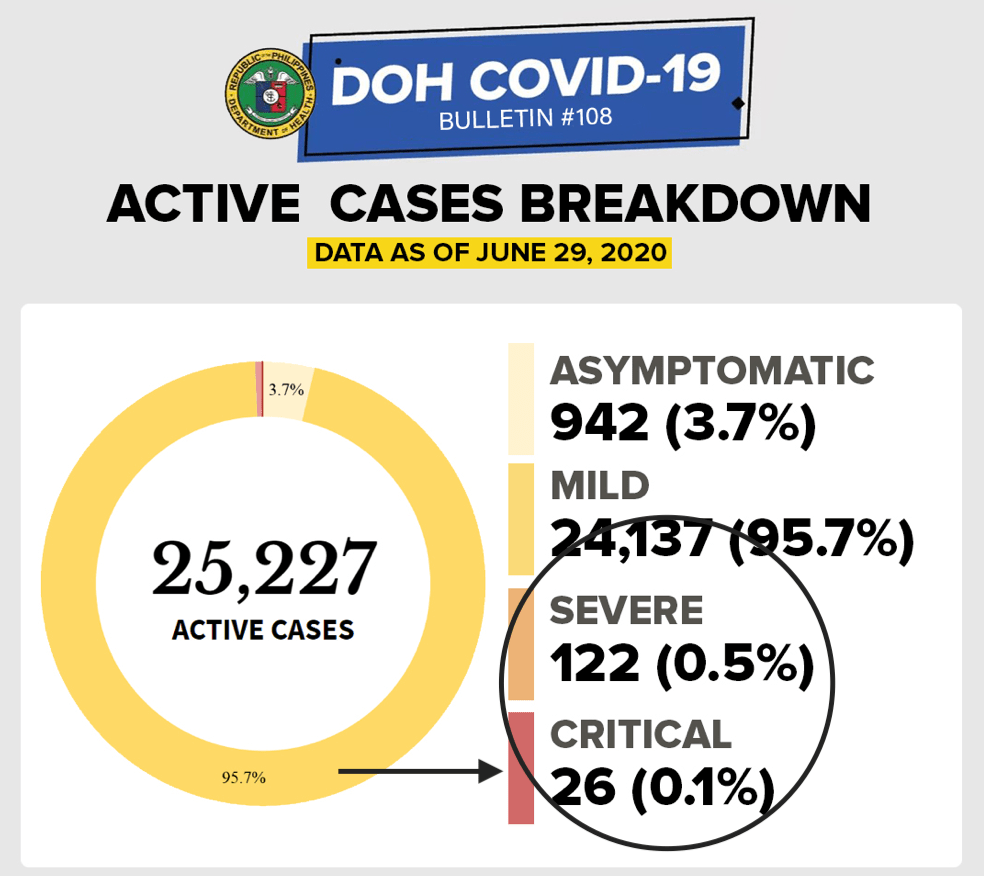
According to the Department of Health data, of the remaining 25,227 active cases, 99.4% of them are mild (24,137 or 95.7%) or asymptomatic (942 or 3.7%). There are four less severe cases today – either the patients recovered or passed away.
The graph on deaths by date of death had some data with proxy. Proxy in data analytics and machine learning may pose discrimination and bias in the outcome of the data. Choosing proxy variables is subjective and while the health agency does not explain what proxy variables it chose to arrive at this extrapolation, hopefully, they are weak variables.
The day before
Of yesterday’s 985 cases, the 4 o’clock summary of the DOH COVID-19 bulletin announced 531 cases supposedly came from “others”, while NCR had 319 cases and Region VII with 135.
WRONG!
Yesterday was a blood bath day for the National Capital Region. NCR did not have 319 cases. At 10 AM today, the final tally was 545 cases with 6 deaths. Region VII had 135 cases and four deaths. Region IVA is in third with 84 cases and one death. Of the 985 cases yesterday, 121 (12.3%) had no tagged location.
Other regions that reported double digits were: Regions III, IX, V, and VI. There were 14 repatriates with positive results yesterday.
Of the 545 cases from the NCR yesterday, 338 (62%) were unknown. The way data is reported in the NCR makes this exercise of reporting unknowns frustrating. The numbers reported daily out of NCR are undoubtedly the highest in the country. Yet it’s such a pain to see them unable to verify their actual locations, making this exercise of counting cases by city an exercise in futility. How do they even reconcile all those “unknown” later on (if ever)?
Based on those with tagged locations, the highest cases were: Quezon City (+51), Caloocan (+24), Manila (+20), Valenzuela (+15), Parañaque (+14), Marikina (+13), 11 cases each for Makati and Navotas; and ten cases each for Malabon and Mandaluyong.
The other cities that reported single digits were: seven cases each for Las Piñas and Pasay City, five for Taguig, four each for Pateros and Pasig, and one for Muntinlupa. Only San Juan had no reported case two days in a row.
Six deaths were reported in NCR – three from Caloocan, two from Manila and one unknown location. (Seriously, I don’t even know why there is an unknown death, when the death certificate should indicate the place of death and the residence of the person that died.)
Region VII reported 135 cases with 4 deaths yesterday. As mentioned in the previous blogs, the number of fewer new confirmed cases are most likely due to lack of testing kits in the region (and not due to the enhanced lockdown as purportedly being attributed to from some reports). This is evident in the report below on testing capacity and in the almost 400% surge in number of cases out of Region VII today.
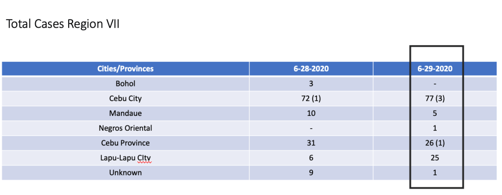
Those with tagged locations reported yesterday were: Cebu City (+77) and three deaths, Cebu Province (+26) and one death, Lapu-Lapu City (+25), Mandaue (+5), and one apiece for Negros Oriental and an unknown.
Region IVA had the third highest number of cases with a total of 84 and one death. As in the case of the other regions, nineteen (23%) were unknown. Those with tagged locations were: Rizal (+30), Cavite (+17), Laguna (+17), and Batangas (+4). The lone death was from Laguna.
Region III had 28 cases. Twenty one came from Bulacan, two from Pampanga and one apiece from Nueva Ecija, Zambales and Tarlac. Two had no tagged residences.
There were twelve cases each from regions IX, V and VI.
The highest cases in region IX? The unknown had 8. Three cases were from Zamboanga del Norte and one case from Zamboanga del Sur.
For region V – Camarines Sur had 4 cases and two cases each for Camarines Norte, Masbate, Naga City and Sorsogon.
The twelve cases of region VI were from Iloilo (4), Negros Occidental (3), Guimaras (2) and 1 apiece from Aklan, Capiz and Iloilo City.
While all other regions reported single digit cases, CAR, MIMAROPA and region XII had no reported case.
These formed the majority of the “others” yesterday.
The results in testing capacity is unusual. While they report an additional 14,014 samples tested on June 28 in 13,182 individuals, bringing the cumulative positivity rate up at 7.1%, it was unusual to alter the data the day before.
On June 27, the initial report of the Department of Health was 13,040 samples were tested in 12,127 individuals. The daily positive rate for June 27 was also the highest at 10.14% since more testing had been performed.
Surprise of the day? The graph for tests done on June 27 changed. It now claims to have 16,289 tests done with 1481 positive (instead of 1323 positive cases) and the daily positive rate went down to 9.1%.
On June 28, total tests done was 14,014 samples in 13,182 individuals. The cumulative positive rate is now at 7.1% due to an increase in daily positive rates at 9.32%. In short, out of every 100 people tested, 9-10 will turn out positive.
However, the positive rates vary per testing facility, as they are in actuality a reflection of the locality.
For example, Region VII has three testing facilities – Cebu TB Reference Laboratory, Vicente Sotto Memorial Medical Center and Allegiant Regional.
Allegiant has not provided any reports in the past 4 days. On June 28, it submitted a report – no tests done.
Let’s examine the two facilities.
Cebu TB Reference Laboratory Gene Expert. One hundred ninety seven out of 748 individuals tested positive on June 28. This gives you a daily positive rate of 26.3% for this facility.
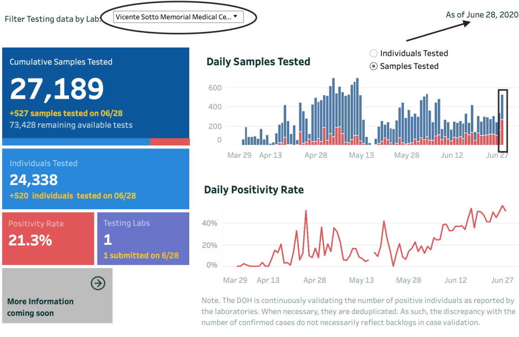
At VSMMC, a total of 265 out of 527 samples tested positive. For a daily positive rate of 50.3%. The highest positive tests for any testing facility in the country.
Now let’s merge both facilities to represent testing results on June 28 for Region VII. You get 462 positives out of 1275 samples or 1268 individual tested.
If you correlate that with the total number of cases out of Region VII today, the 468 cases reported are more or less from the testing results from June 28.
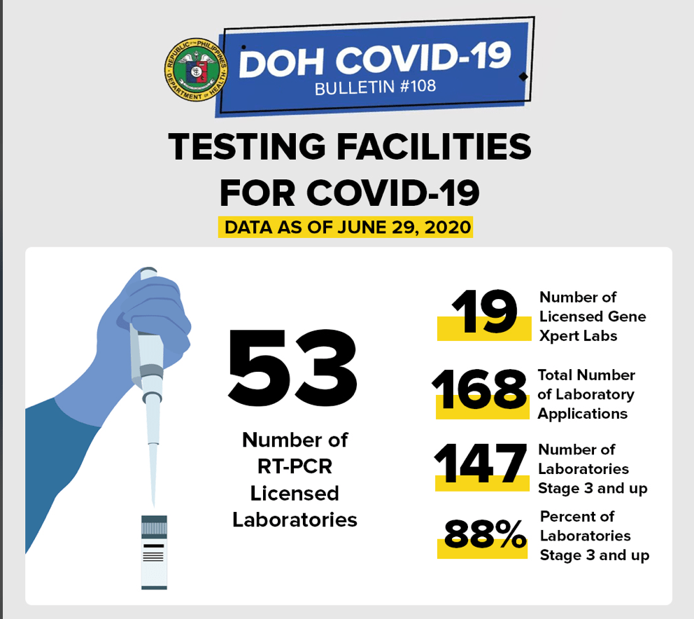
As of today, there are 53 licensed RT-PCR laboratories and 19 licensed Gene-Expert Labs accredited to do confirmatory testing in the Philippines, bringing the total of testing laboratories to 72.
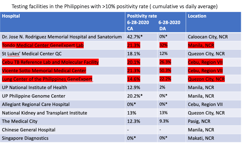
Results vary according to the facility and below is the list of the facilities with > 10% positivity rate. Those highlighted in yellow show the highest cumulative positive rates. While 56 of 64 laboratories submitted reports on June 28, ironically, some of them just submitted reports even if NO samples were tested.
This is observed in the summary of the testing facilities that have >10% positivity rates. On June 28, 2020, Allegiant, Dr. Jose N. Rodriguez Memorial Hospital, UP Philippine Genome Center submitted reports but had zero (-) samples tested. Which means they report they submitted just said “no samples were tested” but they reported. Singapore Diagnostics did not submit any report at all. [Those in asterisk (*) submitted zero cases today].
The following testing facilities had a >10% cumulative average positivity rate. Those highlighted are the ones with increase positive rates overnight.
All data are cumulative average of positive tests
Using the same list above on facilities with >10% cumulative positive rates, highlighted in red are those with increased daily positive rates compared to their cumulative average. [Again, those in asterisk (*) did not test today and therefore had zero percent positivity rate].
CA – cumulative average; DA – daily average
We end the quarter today on a high note. More cases. Discombobulated information. Gaps in data management and integrity. Confusion in the accuracy, capacity and capability of testing centers in the country.
How will the third quarter fare?
With this kind of data being presented – optimism isn’t even a kind description to it.
It will be a miracle if we can bring the numbers down.
[Disclaimer:
All data are verified based on the Data Drop of the Department of Health. All information used in the analysis are from the health agency’s data drop site https://www.doh.gov.ph/2019-nCoV.]
How many tests do we need to say we are testing enough?
It’s a question that’s been going around since the start of the pandemic. Of course, while some would profess that the more we test the better, testing everyone makes no sense.
The right utilization of resources is fundamental in the delivery of health care in countries with limited funds. Remember, even if one tested negative now, it is not a guarantee that you don’t have the virus (tested too early) or that you will never have the virus – ever!
What is a good parameter to say that we’re probably testing ‘enough’?
In communities where RT-PCR testing is done, and a high number of those tested are coming back positive, it’s a sign that we’re not testing enough. In short, there are many more cases that have not been found.
Because we’re currently prioritizing who’s getting tested, more positive result means that the tests are being used to confirm the obvious (clinically symptomatic) cases.
In areas where close contacts and suspected cases are being tested as well, the negative tests coming back are high. Michael Ryan, executive director of the WHO Health Emergencies Program points out that among countries with extensive testing, <12% of their tests are positive.
The benchmark of a system that’s doing enough testing to pick up all the cases is 10-30 negative cases per confirmed positive case (or an overall positivity rate of 3-10%).
The scatter chart above shows another way of seeing the extent of testing relative to the scale of outbreak in various countries in Asia. The one encircled in black is the Philippines.
On a logarithmic scale, the X axis represents the daily confirmed cases per million people. The vertical or Y axis shows the number of tests done (as of the date in the graph).
Based on latest data, the total number of tests the Philippines has done is 378,396 or 3456/M population (with our population of almost 110M). The scatter chart shows that countries that have done more tests have actually lower case fatality rates. For example, Thailand, South Korea, Malaysia, Saudi Arabia, Singapore have had more tests done per million population. And considerably a lesser case fatality rate.
Then there are other countries who have done less tests than us (based on tests per million population) and have had case fatality rates lower than ours.
Except for Iran that had seen an unprecedented number of deaths (8,012) and one of the highest number of cases (160,696), countries like Bangladesh and Taiwan have done less testing compared to us and yet have had very low fatality rates. Indonesia and Japan on the other hand, have done less testing than the Philippines and have seen higher fatality rates than us.
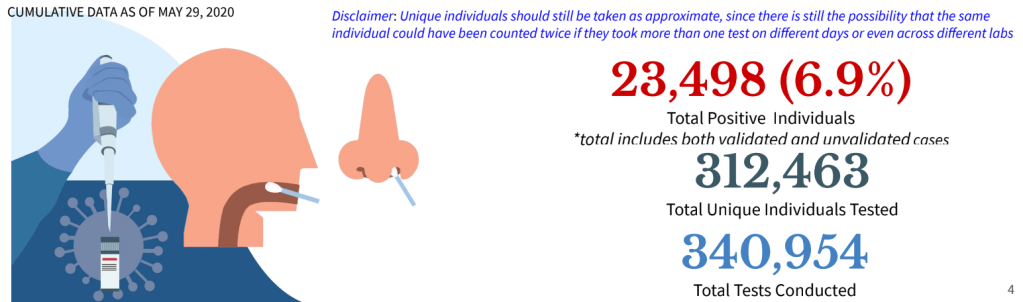
As of June 2, 2020, we have tested 378,296 people with a positive rate of 7.3%. This positive rate of 7.3% is not exclusive to new confirmed cases as the health agency does not discern whether some of these reported tests are retests done among previously positive patients or not. This is one gap that should be addressed as the public feel that the almost 20,000 total cases yesterday still contains a backlog of more than 5000 patients because the positive individuals is more than 25,000. Because of this unknown variable, there may be a further decline in positive rate if we now exclude patients whose positive results are retests.
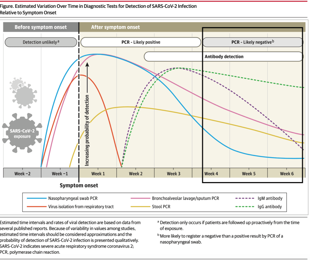
More importantly is the judicious use of the RT-PCR as a testing tool for declaring patients as recovered. The graph below shows the usefulness of varying testing methods. While PCR is most useful within the first three weeks of symptom onset, its value declines significantly among most patients after the second week of illness.
Patients who have clinically recovered after 14-21 days, may be tested ONCE and when negative end testing there, instead of having to test negative two consecutive times (just to fulfill a diagnostic end point that is not clinically justified). Now, we know that there are quite a number of patients that continue to test positive even after 30 days of recovery and attribute that to genetic viral remnants in the oropharyngeal tract. It is therefore recommended that after a patient has tested ONCE to be negative after 14 days of isolation/quarantine AND is clinically well, no additional testing should be done. If patients continue to test positive after this period, they can be observed for 7 more days and if they are clinically well after an extended week of observation, should be considered a recovery with no additional tests done.
Last April 30, 2020, LiveScience published a report on the phenomenon of patients still testing positive even when they clinically recovered. And this phenomenon may be shortcomings in the current testing kits available.
More than 260 COVID-19 patients in South Korea tested positive for the coronavirus after having recovered, raising alarm that the virus might be capable of “reactivating” or infection people more than once. But infectious disease experts now say both are unlikely.
It is a fact that the PCR is unable to distinguish genetic material from an infectious virus and the “dead” viral fragments may linger in the body even after some people have recovered. And that can be explained by the fact that the body has its way of cleaning up broken down cells. This “garbage” is referred to a s cellular corpses destroyed by the virus and within this “garbage” are fragmented remains of non-infectious viral particles.
As a result of the findings in South Korea, under the new protocols, no additional tests are required for cases that have been discharged from isolation and will refer to “re-positive” cases as “PCR re-detected after discharge from isolation” and people should no longer be required to test negative for the virus before returning to work or school after recovering from their illness and completing their isolation period.
On May 30, Singaporean Daviest Ong tested negative for the virus after 68 days in isolation and 22 uncomfortable swab tests in Gleneagles Hospital. On May 28, Health Minister Gan Kim Yong announced that COVID-19 patients in Singapore who are assessed to be clinically well by day 21 of the onset of illness can be discharged without further tests. This new policy took into consideration clinical and scientific evidence on the limitations of the RT-PCR test after a window of recovery.
This comes a few days after the World Health Organization also published its recommendation to shift from transmission-based discharge to time-based discharge for patients who are clinically well. The WHO now recommends that patients who are clinically well can now be discharged after 10 days from the onset of illness, plus at least 3 days without respiratory symptoms or fever.
As we know more about the clinical course of the disease, and see more recoveries as well as the actual picture of SARS-CoV-2 and its disease COVID-19, we are learning how to manage this infectious agent more rationally today than when it began its story in Wuhan, China 6 months ago. Without a vaccine or treatment on the horizon yet, we will need to reinvest on our clinical acumen to reboot the economy…and our lives.
[The updates for the topic “Pandemonium” on this blog site provides a rundown on the daily statistics of this viral infection. As the number of cases globally have spread, it’s difficult to keep up with each and every case. The “brief” will be kept short and simple and center on the cases in the Philippines based on information from the Department of Health. Readers are asked to refer to other sites, especially https://www.worldometers.info/coronavirus/ or https://www.who.int/emergencies/diseases/novel-coronavirus-2019 or https://ourworldindata.org for specific information in particular countries. For references for Philippines data, they are cited separately.]
Update as of 7PM 07 June (Sunday)
TOTAL CONFIRMED CASES:7.007,698
TOTAL DEATHS: 402,683 (case fatality rate: 5.75%)
TOTAL RECOVERED: 3,428,961 (case recovery rate: 49%)
Total cases worldwide (note that every reference has its own cut-off time for reporting. For the global data, https://www.worldometers.info/coronavirus/ is used as its reference.)
We have officially crossed the 7M mark at 7PM. Almost half the total cases having recovered. Of the more than 7M cases, more than half have already had an outcome – 89% have recovered while 11% died. Only a little more than 45% of the cases remain active.
These are good numbers because they indicate that while the number of cases continue to increase (driven by more testing and contact tracing), majority of them already had an outcome and the fatality rate is generally lower now. This could also mean that most the positives were identified from contact tracing and that they are probably mild or asymptomatic/pre-sysmptomatic.
The global data shows that the average cases is still more than 100,000 case per day. The total number of cases are now over the 130,000 per day mark.
Figure 1. Daily confirmed cases since December 31, 2019. The last time we looked back at the lowest numbers was on February 24, 2020. It has been an upward trajectory since and has plateaued at >80,000 confirmed cases per day since April 5. https://www.worldometers.info/coronavirus/
And while the daily new cases plateau at over 130,000 for the 3rd consecutive day, the number of deaths declined from 4906 yesterday to 4253 today.
The United States of America continues to lead globally in the number of total confirmed cases at 1,988,545 (up by more than 22,000 cases overnight) with a case fatality rate (CFR) lower today at 5.64% with 112,096 total deaths recorded. Among the states, New York leads at 396,699 total confirmed cases and 30,372 total deaths up with a lower 7.66% case fatality rate (CFR) as the number of deaths slows down for the last week.
Brazil remains in second with a lower CFR at 5.32% with a haul of over 30,000 cases. Total cases are now at 676,494. Russia is in third with a CFR of 1.25% and total cases of 467,673. India remains in sixth spot with 247,195 cases and a CFR steady at 2.81%.
The South American countries are now the hotbeds in terms of cases for the last two weeks. Brazil tops the list at number 2 in the world, Peru stays at 8th today, and Chile remains in a close 13th place. These three countries combined make up more than 1M cases in the world.
In Southeast Asia, Singapore slips down further to 29th in the world, with Indonesia going up to 32nd spot and the Philippines moves down to 39th from 38th in the world.
Based on the dashboard of the World Health Organization https://covid19.who.int, the global data shows the Americas leading the number of cases, followed by Europe and the Eastern Mediterranean.
As several countries ramp up testing in various degrees, more new confirmed cases are being reported. With more testing and aggressive targeted contact tracing, patients who may be asymptomatic or pre-symptomatic and who may potentially be infective to the vulnerable population are being identified. With more testing, we see a better picture of the extent of the pandemic. There are, however, some countries who may not not be performing a lot of contact tracing and/or testing, but have better outcomes than others that do.
There are multiple factors that determine how outcomes of pandemics play out. Policy responses include school and workplace closures, cancellation of public events and gatherings, restrictions on public gatherings, public information campaigns, stay-at-home restrictions, international and domestic travel (public transport, restrictions on internal movement and international travel controls), and of course, testing and contact tracing.
The median average of case fatality rates worldwide has further declined to 5.75% (from 5.8% yesterday). For the past 2-3 months, over 89% of patients are either asymptomatic or have mild disease and have recovered.
The good news? Recoveries far outnumber the deaths with a ratio of approximately 8.5:1. (The ratio of recoveries continues to increase, and will reassuringly do so, over deaths because of increased testing and better minimum healthcare standards.)
Philippines Statistics
Refer to the link https://www.doh.gov.ph/2019-nCoV for up-to-date data or to http://www.covid19.gov.ph (this latter is not a secure site). The new site for the Department of Health is supposedly migrating to COVIDKAYA so that data is updated. The current site still maintains the COVID19 tracker. Readers can check their official site where Data Drop for raw data can be found.
One useful site is https://covid19stats.ph where one can see the dashboard of information from the DoH website. Unfortunately, because of the migration of the data drop into COVID Kaya, no one is able to break down the numbers to the finer details as in the previous posts.
Good news. Bad news: The wrap for the day
There are 555 new confirmed cases today compared to the 714 yesterday. And expectedly so. Since we’re doing an average of 10,000 tests a day, and the positivity rate is around 7%, (assuming that the positive rate is constant), we should have an output of approximately 700 positive cases a day (not including backlogs).
Today we breach the 1,000 mark for deaths at 1,003 total deaths with 9 deaths publicly reported.
Of the 555 new confirmed total cases, there are more fresh cases (378) than late (177).
Of the 350 “fresh cases”, Region VII has 104 cases, NCR with 67, others at 204, and repatriates with 3.
Of the 177 “late cases”, Region VII has 63 cases, NCR 25 and Others 89.
Fresh or late, the other regions are bothersome because we have 293 of the 555 cases from these “other” areas. Region VII continues its upward trajectory with 167 total cases while the NCR has 92 reported today.
With more backlogs coming in, the numbers are expected to rise. The good news is that the deaths remain low in spite of the increase in number of positive cases. Whether these remaining positive cases are retests from previously positive patients who are recovering or have recovered are unknown.
As of today, the Philippines still adopts the criteria of having two negative consecutive tests to be considered a recovery. This most likely accounts for the low recovery rate because many patients don’t take the initiative to have retesting done, especially when they are mild or asymptomatic and have clinically recovered. Other patients who are retested over and over but remained positive in spite of clinical recovery past the clinical course of illness are probably included in the count on positive tests.
Today’s total brings the case fatality rate of the Philippines to its lowest of 4.58% (good news) and recovery rate is again a tad lower at 20.7% as the number of total cases are still more than 500 today. The low recovery rate is probably due to the reporting system of recoveries in the country with the LGUs having different data from the national agency.
According to the Department of Health, based on the remaining 15,905 active cases remaining as of June 06, 2020, 95.1% (15,131 cases) are mild while the remaining 4.4% (698 cases) are asymptomatic. Only 0.5% of the remaining active patients are severe (57) or critical (19).
With the current data, the growth rate eases at around 3% but the doubling time remains approximately 10 days. While Indonesia has a higher case fatality rate compared to the Philippines (6% vs 4.58%), recovery rates in Indonesia are far better than ours (32% vs 20.7%). Overall, 82% of all cases in the Philippines are recoveries, while 18% lead to death. Making us the lowest among the Southeast Asian countries in terms of recoveries-to closed cases ratio.
Testing capacity
As more RT-PCR laboratories are being licensed, we’re having more tests conducted. At least 3735 test/M population are being carried out per day. As of June 5, a little over 2,000 samples are left in the backlog. Hopefully, this closes in towards the middle of next week.
Of the 420,166 total tests conducted in 386,726 individuals tested, the positivity rate is now lower 7.1% from a previous 7.3% (which means that we are testing enough to see the prevalence of the pandemic in the country. The number of positivity is also going down in spite of the higher testing capacity). This is an important issue to discuss as certain areas in the country have a very high death rate compared to the over-all case fatality rate. It is recommended that those areas with high death rates (>10-12%) should have more aggressive testing and contact tracing done.
For example in one community if there is one death in 1 case, the case fatality rate is 100%. Because the virus is highly infectious, there must be other cases undetected within the community. Targeted aggressive contact tracing should be done within that community so that those that are positive can be quarantined or isolated, in order to contain a potential outbreak.
Majority of the patients tested (~93%) tested negative. This means for every 13 patients, 1 would most likely test positive.
Breakdown the day before
Yesterday, of the 714 new cases announced by the Department of Health, 415 had residence information tagged. 273 cases were reported in Luzon, 173in Visayas, and 5 in Mindanao. There was no report among the repatriates.
Based on cases per region, the NCR still has the most number of cases followed by Region VII and Region VI-A. While Region VII may have more than 3100 cases, it has the lowest fatality rate.
Based on cases per city, 9 of the top 10 cities are within the NCR. Quezon City ranks first, followed by Manila and then Makati. While most of the cities have seen a growth in cases over the past week, the highest increase in growth rate goes to Cebu City with a 4.73% growth rate overnight (from 4.4% the previous day).
These places matter
How many tests should be done to say we’re doing enough testing?
Among countries that do extensive testing, if < 12% are coming back as positive results, then we’re most likely doing enough tests in the country. The benchmark of a system that’s doing enough testing to pick up all or most of the cases is getting 10-30 negative cases per confirmed cases for an overall positivity rate of 3-10%.
How does that kind of data extend to the 7,641 islands of the Philippines? And how can the community use this kind of information in order to determine if they are testing enough?
The death rate or number of deaths is another good indicator if there is sufficient case finding in the community. The same parameter above can be used to determine if the regional or local community is doing enough to combat the virus through targeted testing.
Based on region breakdown for example, Regions 1, 10 and BARRM have >10% case fatality rates, Region 1 has 16% death rate (12/74), Region 10 has 24% (9/34) and BARMM 18% (7/22). [In parenthesis are deaths/confirmed cases]. An indicator that we’re not testing enough or looking for more cases in those regional communities. The likelihood missing out positive cases among deaths due to COVID in these regions is high.
As I previously mentioned, breaking down the cases per barangay or city provides better information to the local community on mitigation actions that they may need to take in order to control the spread of the pandemic. As a general guide, if the death rate in the area is >10-12%, they’re probably not testing enough.
Sometimes the numbers look impressive because the general rule is that the region is doing fine in numbers but the better numbers are being carried by the general data of the region. For example, in the National Capital Region (NCR), where we do extensive testing, the case fatality rate is 6.3%. This is driven by the fact that there are 752 deaths in almost 12,000 cases as of yesterday for the NCR. If you break them down according to cities on the other hand, Pasig (10% CFR), Muntinlupa (10% CFR) and San Juan (13% CFR), have the highest case fatality rates in the National Capital Region.
What is confusing in the gap of information is the disparity in the data on confirmed cases, deaths and recoveries per city compared to that of the Department of Health. This must be reconciled at the soonest.
Remember, there should be ‘enough’ cases for every death because a high death rate implies that the specific locality is not doing enough in contact tracing. It is highly unlikely that the locality had 1 case with 1 death with no other person in the community being infected.
Outside of the National Capital Region, the following cities (according to the Data Drop of the Department of Health as of June 6, 2020) have death rates more than 10-12% and positive cases less than 50: Lipa Batangas (15%), San Mateo Rizal (18%), Marilao Bulacan (12%), Malolos Bulacan (17%), General Trias Cavite (13%), Nasugbu Batangas (14%), Meycauayan Bulacan (17%), Angono Rizal (12%), Bacolod (19%), Cagayan de Oro (33%), Silang Cavite (15%), Trece Martires Cavite (17%), Calauag Quezon (10%), Tarlac City (10%), Calapan Mindoro Oriental (11%), Candelaria Quezon (13%), Naga Camarines Sur (14%), Naic Cavite (14%), Guinobatan Albay (17%), Lambunao Iloilo (21%), Iligan Lanao del Norte (40%), Bayambang Pangasinan (40%), Alitagtag Batangas (25%), Norzagaray Bulacan (25%), Obando Bulacan (25%), San Miguel Bulacan (25%), Labo Camarines Sur (25%), President Roxas Capiz (25%), San Jose Occidental Mindoro (25%).
33% each (1 death in 3 cases) for the following cities: Tabaco Albay, Alfonso Cavite, Guimbal Iloilo, Dumaguete Negros Oriental, Solano Nueva Vizcaya, Bacolor Pampanga, Floridablanca Pampanga, Lingayen Pangasinan, Malasigui Pangasinan, Rosales Pangasinan, Jalajala Rizal, Castillejos Zambales, Pagadian Zamboanga.
The following municipalities/cities reported only 2 cases but had either ONE or TWO deaths: Cuenca Batangas, Taal Batangas, San Ildefonso Bulacan, Carcar Cebu, Daanbantayan Cebu, Samal Davao del Norte, Malta Davao Occidental, Barotac Nuevo Iloilo, Agoo La Union, Banaue La Union, Mantao Lanao del Sur, Tudela Misamis Occidental, Jimalalud Negros Oriental, General Mamerto Natividad, Jaen Nueva Ecija, Puerto Princesa Palawan, Candaba Pampanga, Alaminos Pangasinan.
The following areas had 1 case and the only reported case had died for a 100% death rate: Catarman Cebu, San Juan La Union, Sta. Maria Laguna, Tayasan Negros Oriental, Naujan Oriental Mindoro, Apalit Pampanga, Barista Pangasinan, San Fabian Pangasinan, Urbiztondo Pangasinan, Tiaong Quezon, Lambayong Mariano Marcos Sultan Kudarat, and Indanan Sulu.
[Disclaimer: The aforementioned data are from the Department of Health data drop as of June 6, 2020. LGU data may be different and the author recommends that the LGU coordinate with the DILG and the DoH regarding reconciliation of data.]
The week in review
To recap the week in one word – shocker!
With all the backlog details returning in bulk, the Philippines had seen a significant rise in cases as more tests were being conducted as well.
While we had an upsurge in cases at the start of the week, the good news is that the number of deaths have remained low. As a matter of fact, generally the average deaths for the week was 6 deaths/day, while the average number of confirmed cases (fresh or otherwise) was 588 cases/day. Recoveries were very slow considering that most of these patients should have recovered as the majority (~94%) are mild and around 5.5% are asymptomatic. Cases as far back as May 22 should have seen outcomes already based on the DoH claim that of the remaining over 15,000 active cases being mild/asymptomatic.
In the last graph above, this shows a summary of how we’re doing overall since the beginning of the pandemic. The blue curve showed a decline in cases (bending of the curve) until a week ago when the backlogs and more testing results came in. This resulted in the increase in the number of cases for the past week. But the green curve shows a continuous trajectory of the death rates in the country in spite of the single day surge of publicly announced death reports.
Over the past week, the National Capital Region had 1,174 additional cases but the 7 day average growth rate was at 1.49% with a CFR of 6.31% and recovery rates at 27%. Region VII on the other hand saw a spike of 1,164 additional cases over the week with a 7 day average growth rate at 6.48%, a low CFR of 0.86% and a low recovery rate of 4.16%.
Children below 19 years old make up 7.57% of the total cases while 18.14% are the senior citizens (> 60 years old). This means that almost 75% belong to the 20-59 year old age group (out of 21,340 data points). The group that’s actually allowed to roam around and go out.
In terms of fatality rate, those below 19 years old have a death rate of 2.3% whole those above 60 years old have a death rate of almost 65%.
How is the coming week going to fare?
With the backlog data coming in and more testing being done, we may probably still be averaging over 500-1000 cases a day in the coming week. As long as the death rates remain low, then that’s the good news. The better news? The positivity rates decline significantly so that the numbers start going down. If we get both, it’s called a blessing.
To get in touch with the Department of Health, the COVID hotline is (02)894-COVID loc 1555.
Disclaimers:
(1) These three parameters (new confirmed cases, new recoveries, new deaths) ARE NOT real-time data. The data provided by the Department of Health is the date of public announcement. Even global data will vary in time of reporting, depending on the reporting capacity of that country. To date, the latency period of the Department of Health on reporting recoveries averages almost 10 days (with more than 50% reported after 8 days and more) and deaths averaging almost 12 days (with more than 50% being reported after 8 days or more).
(2) Depending on where testing is done, RT-PCR test results take an average of 12hrs – 2 days to process. Barring any delays, all tests done should ideally be released by at least 48 hours (the earlier the better). However, the test results released from government facilities now range from 3-7 days (based on Data Drop) when compared to private hospitals where fewer number of tests are performed.
They announce the summary in the evening…but the specific data in the Data Drop are not available until 10AM the following day. So here”s what happened yesterday and announced at 8PM last night.
Their “fresh cases” today are up at 252 from 46 the previous night. The “late cases” (> 4 days into validation) is 338 for a grand total of 590 cases reported last night – lower than the yesterday’s 1046 but higher than the previous day’s 539. There were 8 deaths and 88 recoveries reported, bringing the case fatality rate to an all time low of 5.5%. Unfortunately, because of the higher number of confirmed cases (fresh or otherwise), the recovery rates have also been dragged down a low of 22.1%.
This change in the reporting system in order to address the backlog in data has sparked confusion, not only to the ordinary layman but to the medical community as well who’ve been constantly following the numbers in order to craft policies at the workplace (hospital or business) as the GCQ (general community quarantine) takes into effect tomorrow.
Unfortunately, it is what it is and we need to contend with what is in the Data Drop system.
As of May 29, more than 340,000 tests have been conducted (+8138 tests done) in 312,463 (+7347) total unique individuals. Of the total number of individuals tested only 6.9% are positive. Or a total of 23,498 positive individuals (both validated and unvalidated cases). Since there are only 17,224 confirmed cases as of last night, there are around 6000+ missing positive patients. These may not necessarily be NEW confirmed patients but previously positive patients who have had repeat testing done, remained positive and are still up for repeat testing. It is also difficult to separate patients who have tests done in one facility and have repeat tests done in another facility. But since I am not privy on how information is collected for these patients, I am speculating that this may be a problem that the health agency is plagued with. Validating this kind of information is labor intensive and leaves no room for human error. Elaborating on this discrepancy by the agency should allay the public’s fear of why the numbers have recently gone up.
Consistency and accuracy in data is vital to any report or pronouncement by the agency.
When they announce a total of 17,224 cases in their summary press release last night and yet in their own website announce this, you know that we have a problem even in validating the official information that is dished out by the agency.
Of the 252 “fresh cases” and 338 “late cases”, 162 and 218, respectively came from the National Capital Region. This makes a total of 380 cases from the NCR alone (fresh or otherwise). There is no breakdown on which are fresh or late but of the 380, 236 (62%) are still for validation. Those validated are: Caloocan City (27), Manila (20), Malabon (20), Marikina (15), Quezon City (12), Navotas (7), San Juan (6); Valenzuela, Pasay City, Pasig, and Makati with 5 each; Taguig (3); Parañaque (2), and 1 apiece for Las Piñas and Muntinlupa.
What I don’t get is how these places got included in the NCR as separate cities.
Region VII reported 18 fresh cases. There were no late cases reported. The only conclusion one can make from this is that (a) there’s no backlog in the Region VII data and (b) all the data yesterday – 11 from Cebu City and 7 from Mandaue are within the three days window.
The 9 reported repatriates are all late data (> 4 days ago).
The remaining 183 (72 fresh and 111 late) are a basket of information where you cannot discern which are “fresh” and which are considered “late”.
Region IV-A for example has 29 data for validation while those with reports are from Rizal (4), Laguna (1), Cavite (4).
Region III (Central Luzon) has 4 for validation with confirmed reports from Bulacan (5), Bataan (1).
Region VI reported 1 apiece from Iloilo Province, Antique and Bacolod City.
Region I had 1 case from Pangasinan and 2 from La Union.
The Bicol Region (Region V) has 4 cases for validation but reported 1 from Albay and 1 from Camarines Sur.
Region IX reported 1 case from Zamboanga City.
Region II (Cagayan Valley) reported 1 from Isabela.
Region IV-B (MIMAROPA) have 2 cases for validation still.
Region XII has 1 reported case from General Santos City.
And there are 117 cases for validation from – well, your guess is as good as mine.
I am surmising (again) that these for validation (for validation) are probably patients without tagged residences. Again, as to why there is no information on them needs to addressed by the health agency. Perhaps informing the local government RESU on the completeness of the documents submitted to them should be the rule rather than the exception. Actually, for awhile there, the Department of Health was able to consistently provide almost 100% tagged residences especially during late April to mid-May.
Finally there is the BEAT COVID informatics they provide. While there is a wealth of information there, the barrage in information that may not be totally relevant to the public is difficult to keep up with.
For example, under case breakdown of ACTIVE CASES as of May 29, it is good to know that most the active cases are actually mild (93.4%) and that the asymptomatic comprise only 6% of the total cases. As of this date, 56 have severe illness and 18 are critical.
If there are only 18 critical (let’s even throw in the 56 severe) cases among the active cases, why are 358 mechanical ventilators in use and 463 ICU beds occupied? This is under the heading of Hospital Beds and Mechanical Ventilators Dedicated to COVID-19 CASES!
While I can feel how overwhelmed the health agency is, pointing out these inconsistencies is intended to make them aware that people are following them. After all, who else can we trust our health if not from our health agency?
Integrity of data is vital to every healthcare system. After all, it is the basis of policies made by the government.
There are two terms that are used complementary to one another to determine if a country has the pandemic under control.
Bending the curve refers to the graphical representation that the number of daily cases is plateauing and later on sees a continuous decline in the trajectory of the curve.
Figure 1 above illustrates the current condition of various countries based on days since the first cases reached 30/day (X axis) and the number of cases (in logarithmic scale, Y-axis). One can see that there are countries that are still on an upward trajectory while others have begun to bend (slightly or significantly) their curves.
Has the Philippines bent its curve?
Figure 2. Daily confirmed deaths due to COVID-19 (United States, Italy, Indonesia, the Philippines, South Korea, and Brazil)Figure 3. Daily vs total confirmed deaths due to COVID-19 (in red is the United States). Other countries illustrated include Brazil, Italy, South Korea. Indonesia and the Philippines. https://ourworldindata.org/covid-deaths
Figures 2 & 3 above show how we are faring. And while the United States may have the most cases in the world, they have also begun to bend the death curve with less daily deaths vs total confirmed cases as well. Brazil on the other hand is the new epicenter in the world to watch out for as its death rates begin to climb staggeringly. Indonesia still has an upward trajectory for deaths (in proportion to their upward trajectory in cases, see Figure 6 below).
The other term used by epidemiologists is more commonly known as “flattening” the curve. Let me delve on this a bit as this has caused some confusion among the public.
Flattening a curve does not imply that the curve should flatten to ZERO. It is a misconception among lay that a curve in order to be called “flattened” is pressed to the ground.
In a pandemic, the curve varies in shapes from country to country, with some countries taking a steeper climb than others. As a general rule, when a country has a steeper rise in cases (more people get infected), it will also have a steep fall (the patients either get better or die because the virus has infected a large segment of the population already).
A steep rise in cases carries a large burden on the health system. Too many sick people overwhelm the healthcare system and overloading beyond the capacity to treat people results in greater death rates. More people die not only because there are no more hospital beds, but the overall health system – from healthcare workers to basic supplies – are exhausted rapidly.
Interventions like the ECQ and social distancing, hygiene, wearing masks and other ways at minimizing the transmissibility of an infection from one person to another (i.e.. school closure, limiting travel and work, closing borders and minimizing movements) are ways to flatten the curve. A flatter curve does not mean that we pummel the curve to the ground (although wouldn’t that be great?). When we flatten the curve, we slow down the infection rate. It assumes that the same number of people eventually get infected, but over a longer period of time. Slowing down the infection de-stresses the health care system.
That’s the story of the COVID-19.
There is currently no vaccine or drug to treat this disease and we’re all scrambling at the availability (or unavailability) of testing. The collective action of everyone in the community is needed in order to address the challenge of seeing a decline in the cases of COVID19.
Have we flattened our curve?
Figure 4 above illustrates the health care capacity of a country in the broken lines. Without precautions during a pandemic, the number of people infected would be disproportional to the health care capacity resulting in a direct collapse of the health system and indirectly leading to more deaths. The “flatter curve” (in orange hue) has the same area under the curve (number of patients) but spread out over a period of time when compared to the more steep curve (in dark pink when no precautions are observed).
Figure 5. Image from the CDC and criteria for claiming “flattening of the curve”
There are two major criteria (shown in figure 5) to say that the curve has flattened. (1) Slow acceleration of number of cases, and (2) reduction in the peak number of cases and related demands on hospitals and infrastructure. I would boldly venture on saying that the overall reduction in death rate is an ideal parameter to indicate that we’ve reduced the demand on hospitals and infrastructure.
As of May 20, 2020, the DoH reports that facility capacity of various hospitals in the Philippines is not overwhelmed. Only 34.5% of total ICU beds and 17.8% of mechanical ventilators are being used.
The death rates have also dramatically dropped weekly. From April 26 – May 2, the average deaths was 16/day. May 3 – May 9 showed an average of 15/day. May 10 – May 16 an average of 16/day. May 17 – May 23 show a dramatic drop to 6/day.
Number of new confirmed cases are also on the decline. The last 4 weeks (since April 26) saw a 7 day average of 240 cases/day. To say that we’re slowing the acceleration of cases is to see a conservative decline by at least 10% from the average of the previous week. We ended last week with an average of 242 cases/day. I wanted to test the threshold of 225 cases/day for the week. THE 7 DAY AVERAGE FOR THE WEEK OF MAY 17-23 is 210!
With this new 7 day average for last week, we now test the threshold of 190 cases/day for the coming week. If this is sustained in spite of latent data, then we can confidently say that we have not only begun to, but we have flattened the curve. (This has to be something consistently seen over a 4 week period).
Figure 6. Daily vs Total confirmed COVID-19 cases (US, Italy, Philippines, Indonesia, South Korea and Brazil)
Figure 6 above shows the Philippines and the United States plateauing on cases, with Brazil now in an upward trajectory. A plateauing of cases means a slowing down in the trajectory (shifting the curve to the right). If we sustain at declining by 10% the weekly threshold, we will have similar bending curves as South Korea and Italy. While Indonesia may have lower death rates compared to the Philippines, its cases remain on an upward trajectory and have not plateaued yet.
Statistics for the day
The world is now at 5,328,548 confirmed cases with 340,425 deaths (6.39% case fatality rate) and 2,175,290 recoveries (40.8% case recovery rates). The ratio of recoveries to deaths is higher at 6.4:1.
Back home in the Philippines, the Department of Health has publicly announced 180 new cases, 85 new recoveries and 6 new deaths.
Our case fatality rate has improved and is now down to 6.26% with recovery rates up at 23.06%. Globally we rank now lower in recovery rates at 140 (out of 165 countries), and are doing much better at number 30 (from number 29) in death rates.
The Department of Health website has not updated the Data Drop files as of this writing but reported that of the 180 new cases today, 114 (63%) are from the NCR while the remaining 66 (36%) are from others. The NCR remains to be a hotspot contributing to more than 60% of the daily cases reported in the Philippines.
Update (May 24, 2020)
Based on the DoH website this morning of the 114 cases in the NCR, Quezon City is back on top of the heap (25), followed by Manila (23) and Makati (16). The rest include: Caloocan City (15); Malabon (6); Marikina and Mandaluyong (5 each); San Juan (2); and Parañaque, Pasig, Taguig, Pasay City, Muntinlupa, Las Piñas and Pateros with 1 apiece. Only Navotas had no reported case yesterday. There were 9 cases for validation.
Of the remaining 66 cases, almost 60% was from Davao City alone with 38 new cases. The rest were from Rizal (4), Laguna (1), Cavite (5), Batangas (1), Quezon (1), Bulacan (3), Bataan (3), Nueva Ecija (1), Iloilo Province (1), Iloilo City (1), Baguio (1), Cagayan de Oro (1), Cotabato (1), Surigao del Norte (1) and the remaining were for validation.
As of May 22, 2020, a total of 287,294 tests have been done among 265,061 individuals with 20,264 testing positive (7.6% positivity rate). There were a total of 9,504 tests done yesterday alone (6% of who were positive). As of yesterday, there are 7,128 samples in the backlog.
Disclaimer: All information provided in the daily reports and updates are based on the Data Drop of the Department of Health website. The accuracy of information is dependent on the information released from the DoH. All other graphs, citations and projections are referenced appropriately. Any change in future data particularly on latency reporting may affect the overall trend cited in this post.
The pronouncement of the health secretary that we’re in our “second wave” in the pandemic deserves an explanation for why I disagree.
According to reports, the claim is based on the fact that the first infections and death seen in the archipelago was the first wave. To him it may make sense because we came from zero cases. The first three cases and the first death were interpreted by their epidemiologists as the first wave. If that argument were to hold water then every country that has not reported any case at the start has had its first wave already. As a matter of fact, we have overtaken China because Wuhan has not even declared a second wave. Nor has South Korea and Singapore, in spite of the minimal uptick in cases.
Which means that all 212 countries are in their second wave of the infection. A most likely unacceptable argument regarding the understanding of what epidemiological waves of diseases are. But let’s simplify it for clarity.
Figure 1. Temporal dimension of an epidemic
If you look at the above figure, let’s focus on the temporal dimension (time on the X axis). The cases are on the Y axis. The epidemic wave plots cases against time. During an epidemic the number of new cases increases rapidly to a peak then falls gradually till the epidemic is over.
The concept of epidemic wave helps describe the number of people affected by the disease (new confirmed cases) and the possibility that the course of the epidemic may be predictable. The reasons for many disciplines – from biology to mathematics to even economists – to become interested in the subject.
Figure 2 on the left above shows new cases. In red, it shows that the cases rise then gradually tapers off until the epidemic comes to an end with 0 cases. In blue is the cumulative number of cases. Notice that there are two X axes – on the outermost left is the number of new cases while on the outermost right the cumulative number of cases (overall total). As the new cases reach a peak and then begin to decline (in red), the cumulative cases plateau because there are no added cases (in blue).
Every case has an outcome. Either the infection is resolved or results in death. On the right side of Figure 2, you see deaths as the endpoint. The pattern for people dying from the disease is a bit different from the number of cases. Notice this time (in blue) that there are peaks and troughs in between. The swings mean that death is not constant.
Nevertheless, during the whole epidemic, as you see the number of cases decline, there is also a proportional decrease in mortality. When there are no more cases, there are also no more deaths.
Figure 3. Measles epidemics in various countries from 1945-1970
To get a clear understanding of an epidemic wave, Figure 3 above shows how waves from one disease alone – measles as an example – would differ from country to country. Some epidemics may occur annually (like the US) while it is more spaced apart for other countries like Denmark or even Iceland. Epidemic waves occur when public health measures are not properly instituted. Nevertheless, if you look at Figure 3, notice that these so-called “waves” have different peaks. Which means that after one outbreak is controlled, because of ongoing local transmission of the disease, another outbreak is likely to happen but not necessarily of the same magnitude.
Figures 4 and 5 show the number of daily confirmed cases and deaths in the Philippines. I am unsure where the basis of the first wave to the declaration of a second wave of infection lies. First of all, we have not even flattened the curve. So I don’t know what wave their epidemiologists are talking about. The number of daily new cases remain above 200 (in fact today we saw another rise above the 7 day average threshold last week of 242). But that cannot be faulted on actual cases reported because in reality, the latency of data is stupendous. Recoveries now take almost 10 days to report, while deaths more than 9 days. There are so many layers of validation that it’s so difficult to make heads or tails of the data. Are we or aren’t we doing better? In spite of the almost 2 1/2 months of community quarantine, we seem to not be gaining much headway in terms of new confirmed cases.
Perhaps the secretary of health should provide a clear explanation on his basis for saying we are actually in the second wave to allay public fears on how and when this second wave appeared. Because if indeed a first wave occurred when three cases occurred with one death way back in the end of January of early February, it goes back to the question – what did the agency do to mitigate this “first wave”? Should there not have been more aggressive measures recommended instead of having to wait for the tsunami that came along in March? And the fault for not having defused the first wave goes back to the agency.
Nevertheless, the good news is that we are actually seeing a slowing down in death rates. As I mentioned, every pandemic will have an endpoint – death or recovery. It is common sense that when there are no more cases, there will be no more deaths due to that infection. In the meantime, I defer to the other epidemiologists to provide an explanation of the so-called “second wave”. Personally, and I may be wrong here, we have not even flattened the curve.
In the interest of transparency, the health agency must reveal how much more backlog information they have and when the surprise reveal will be.
The bar graph above shows the daily deaths reported (in blue) and the date they died (red). Which actually is what the reports of the DoH show (not considering that a lot of data is still latent). Hopefully we will not get surprise numbers in the end. And that the number of deaths continue to actually decline.
The second graph shows us data on hospital admissions. The dramatic decline in hospital admission is also a good sign that perhaps we’re not getting sicker patients. Less severe and less critically ill. Which means that the intervention of quarantine, social distancing, hygiene and PPE actually created a large impact on the number of patients requiring hospitalization. The more vulnerable patients stayed home. The general population was less at risk.
But to declare that we have flattened the curve based on these two parameters is not accurate from the medical point of view. The majority of cases we’re seeing now are asymptomatic or mild cases. As long as the number of new confirmed cases are up, there will always be risks to the community at large. Hence, it is disturbing that one cherry picks on data without looking at the over-all picture.
Let’s agree that there are gains being made in the challenging fight against this virus. But let’s have a more uniformed scientific approach by being cautious at what we predict and not be alarmist to a public that is already on the edge of their seats at this pandemic.
Then there’s the confusion on return to work requirements
If the twin confusion above was not enough for the day, there’s a statement from one of the advisers of the president that all the doctors do is to complain. Particularly on the use of the rapid testing kits.
For the record, while it may seem like a complaint to him, for those of us who know what we actually are doing and recommending, the use of rapid testing kits as a requirement for workers to return to work is not scientifically sound and adds up additional expenses to the employer for a tool that may not be at all that useful.
Figure 6. Diagnostic Tests in the Detection of SARS-CoV-2 infection.
Rapid diagnostic tests are antibody detection tests. Which means that while they may find some use in the latter phase of the infection after a quarantine period, it give you a false sense of complacency when patients get tested during the first 10 days of illness – during the incubation period. Most likely they will test negative EVEN if they have the virus.
To address the issue that all the doctors do is to complain, let me write down what I believe should be a sound recommendation.
Nothing works as good as a good triage. In short you need to assign people who will check each and everyone (including the employer) for symptoms before they are allowed to work. This is because more than 80% of transmission of COVID19 are from patients who have symptoms. Always ask returning workers about a history of FEVER and RESPIRATORY SYMPTOMS in last 2-3 weeks. If they had a combination of these, test with RT-PCR if you suspect them to have COVID19. Keep them isolated for 2-3 weeks regardless of the RT-PCR result. If they turn out positive, then they need to be cleared based on the protocol of the Department of Health before they are able to return to work. If they test negative and have had no symptoms after being quarantined for the last 2-3 weeks, then they can return to work.
I have not encountered any literature or recommendation on the ideal laboratory test to clear workers who have no symptoms for work. If you refer to Figure 6 above, a rapid antibody will be falsely negative in a patient who is incubating with the virus in the early part of the infection. If a patient has been asymptomatic for 2-3 weeks and test (+) IgG and (+) IgM it’s either the patient has had an infection and recovered or may have false positive results.
If you do RT-PCR in a patient who doesn’t have symptoms, it may NOT be cost-effective to screen everyone considering the cost of doing RT-PCR. Besides, one negative test does not mean that the patient does not have the virus. After all, even RT-PCR will be negative in 1/3 of patients.
Not all the antibody tests are the same. If a company decides on using them to screen their workers who come back to work, make sure that it’s a validated test kit. It does not mean that just because it is registered with the Philippine FDA, it has been validated already. Use kits that have high sensitivity and specificity. While these may be more expensive than some other kits, precision is a price worth paying for.
The takeaway message is that this virus will be with us for quite awhile and yes the economy is hurting. That includes us, the doctors who practice and yet risk our lives to see patients who are sick.
Yet reality and practicality tells me that even if you test once and test negative, you can still get infected tomorrow or anytime in this pandemic. Because it isn’t over yet. And the numbers tell us that we’re nowhere near a flattening of the curve.
While testing has its use and may be part of the solution, it also has its limits. Let us use these tests judiciously at the same time without having to burden employers with additional costs for something that may not have much cost-benefit in the end. Moving forward, really need a paradigm shift in the way we live, work and play.
Our case fatality rate is lower at 6.37% (we now rank 28 of 163 countries in deaths) compared to the global average of 6.5% and the ASEAN average of 2.43%. Our case recovery rate is also up at 22.2% ( we still rank lower at 134 out of 163 countries) compared to the global average of 39.4% and the ASEAN average of 40.7%.
The site of the Department of Health is down as of this writing so we cannot verify the additional information that they released. Nevertheless, I’m posting what they announced. We had a jump in new confirmed cases up now at 279 with 150 (54%) from the NCR, 14 from Region 7 (5%) and 115 from others (41%).
[After this explanation, we go back to THEBRIEF tomorrow.]
Tomorrow, would be our last day into the next extension of our enhanced community quarantine (ECQ), otherwise called a lockdown.
While I try to make sense of the numerical values that are being provided by the government, one cannot help but be skeptical about the kind of information that is being gathered.
During one of the online meetings, the easiest question asked was – “what do I make of the numbers” that are being announced daily regarding the aCOVID-19 statistics?
After all, it’s been 45 days since the lockdown.
The anatomy of disappointment are expectations.
We expect that the government has and is doing enough at addressing the pandemic in the Philippines. Although we know that politics plays a role in how this pandemic is addressed, I will not delve into this. (But I would still caution any government or anyone for that matter that utilizes politics as a means for future political mileage to check their moral compass.) After all, no one will ever be prepared for a crisis of this magnitude. No government will have concrete immediate answers to the crisis at hand. All they can do now, is try the very best to approach this issue in a scientific, sensible, feasible, realizable, rational manner.
I am sure most of us were expecting that with the initial 30 days ECQ, the number of cases – admission and deaths – would have gone down, and see more recoveries. But the first 30 days simply showed dismal numbers. Plotted on a linear graph, Figure 1 below shows the see-saw of daily data being reported.
So we go back to the question asked. How do you interpret this data?
The answer is simple. With caution.
The numbers that come in are just numerical values. Considering the various constraints the Department of Health is encountering in the transmittal, accuracy of information being given to them from the various local government units, and verification of data – it is difficult to make heads or tails with the numbers. These factors account for latency in data. Many people look at the numbers and jump to the conclusion that we have too many deaths and too few recoveries. A quick look at daily data being churned out makes one presume that all these may have happened “the day before”.
Figure 1. Daily number of new cases, new deaths and new recoveries in the Philippines. https://covid19stats.ph
On the other hand, if I converted the graph to a logarithmic scale, the data of the Philippines would look like what we have in figure 2. Instead of the see-saw pattern, you’d get a curve.
A logarithmic scale is very different from a linear one. In short, a logarithmic scale best expresses the exponential growth of what we want to measure. In this case on Figure 2, the total confirmed COVID-19 cases and how rapidly they are increasing.
The logarithmic scale can only be plotted once the first 100 patients are reached (so that we can measure exponential growth). The Philippines reached that on March 15, 2020 with 111 confirmed cases. The X-axis shows the cases over time (number of days since the 100th confirmed case). The light grey colored lines at the background show where we are in terms of doubling time based on the data we have. Twenty (20) days after our first 100th confirmed case, our doubling time was approximately 3-5 days (~4.2) with 3,870 confirmed cases around April 4. Forty days after our first 100th confirmed case, our doubling time is now between 5-10 (~7.5) with 8212 total confirmed cases to date.
Which means, we’re now bending the curve because the growth rate has markedly decline to an average of 2.8%.
But all these data have no meaning when you take into consideration the inaccuracy due to reporting errors and problems seen on the ground.
Why do we need to be obsessed with data accuracy?
It’s a simple answer.
The decisions being made for and on behalf of this crisis hinges on quality data. Any decision for that matter cannot be drawn from gut feeling. Decisions and recommendations made need to make recommendations backed up by solid data that will withstand scrutiny. While there will be acceptable gaps, these gaps when recognized early on should be addressed immediately because the extension of the ECQ was primarily based on the issue of not being able to “flatten the curve” or in this case, bending the curve.
The second important parameter will always be death.
Deaths (more than recoveries) provide closure to any event. Looking at the curve for death from an overall number of cases (see Figure 1) may give us a false sense of security. One glance and one can see that on a linear scale, our deaths are but a handful each day. But the latency in death reports in the Philippines average ~6.5 days, with more than 35% being reported after 8 days or more. As of yesterday, 316 of the deaths were reported posthumously – they died before they were even declared positive from the virus.
The quality of these numbers is disappointing because the other ramifications of good contact tracing, isolation and quarantine and work-up of patients exposed to those that have had the disease becomes a work nightmare and is hazardous to healthcare workers who are falling off the grid like flies.
Figure 3. Logarithmic scale of deaths in the Philippines. Y axis is in logarithmic scale. X axis begins on the day the first 5 deaths were reported. https://ourworldindata.org/coronavirus
Figure 3 transforms the linear data into a logarithmic scale. It reported its 5th death on March 28. On the 20th day up to the publication of this article, it has remained above 10. Those numbers need to be “bent” in order to see the impact of the ECQ on death rates due to SARS-CoV-2.
So why do I feel that we’re into the perfect storm?
As a general rule, COVID is not the only health problem we currently have. The nonCOVID cases, far outnumber the Coronavirus cases. In short, SARS-COV-2 or COVID-19 has served as a major distractor in seeing the real health picture of the country. At the beginning of this storm, we were battling poliovirus. Last year we hardly recovered from the onslaught of measles and dengue. One infectious disease after another. Where are we now with cases of polio and dengue and measles? I would appreciate it if someone could give us clear data that the war against COVID is a far greater one than other vaccine preventable diseases. After all, at the current crisis, I am sure that the Department of Health has all hands on deck with COVID. We also need clear data on the other noncommunicable diseases (NCDs) and the mortality from NCDs.
Based on published data from the Department of Health’s website, http://www.doh.gov.ph/mortality in 2013, there were 531,280 registered deaths from all causes in all age groups. That’s an average of more than 44,000 deaths a month. Deaths mostly came from the most dense populations – 13.4% from NCR (71,050) and 14.3% from Calabarzon (75,743). How are the 558 deaths (from January to April 29, 2020) from COVID-19 impacting the overall health care of the Filipino people? Focusing our attention solely at COVID-19 is poor planning in the allocation of health resources and healthcare because the greater majority (those with cancer, heart disease, on dialysis, had a stroke, accidents, infants with sepsis, dengue, etc.) will need equally, if not greater attention, than COVID cases alone.
June is fast approaching.
And the onslaught of the rainy season brings with it a cycle of other infectious diseases the present in a similar way as Coronavirus would present at the onset of illness.
Fever. Colds. Chills. Cough.
Dengue. Measles. Seasonal Flu…to name a few.
Hence the urgency in getting out of this pandemic really quick.
It is a difficult and arduous task ahead for the head of state to bring its people out of this pandemic. But it needs to be done in unison. It needs to make policies based on worthwhile real-time factual data that is not confusing. People in government cannot just make senseless statements that there’s nothing we can do about this pandemic because there is. Other countries are able to bring down their mortality rates and eventually the cases by doing more testing and channeling more resources at contact tracing and practical measures in isolating those who come in contact with positive cases.
While it may be a tall order, it is one that requires a sense of urgency not only through ECQs or praying that a cure or vaccine be made available soonest. The most practical and doable is getting the numbers right from the get go. Only then can we make valuable and sensible plans on how to win the war against this virus.
I cannot overemphasize the urgency in getting out of this Coronavirus pandemic. Otherwise, like a ship that sails into a deep vast unknown ocean with no tracking device, we’re heading into the perfect storm.